What do you do when a house that is built to last, is also outdated and ‘ugly’? For Emma Potter of Breadbox Interiors and architect Adrian Fratelle from Ecohabit Homes, it meant keeping a typical Italian 1970s home in Fremantle, Perth that came complete with pillars, stone lions, endless arches and a back garden encased in 25cm thick concrete, but giving it a massive makeover.
“The house was so solid, we couldn’t bring ourselves to knock it down,” said Potter, who, drawn to the property’s spacious backyard, purchased the home for herself and her family.
Below left: the original house before its makeover
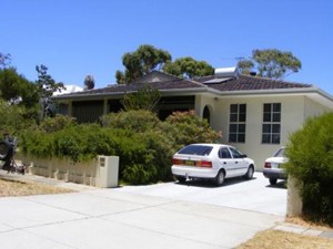 “It was built to last and it was a mission to renovate in lots of ways, but it also felt like sacrilege to knock down because of that very reason. It was ugly! Everything was brown and olive green. The floors were tiled with orange sandstone with a slate look. There was a jarrah bar and the kitchen was jarrah doors and benches. All beautiful materials, but together they were dated and absorbed the limited light that could get in. It didn’t have a pretty frontage. It was a heavy and dark house throughout.”
Despite being advised by architects and builders to knock the existing building down and start from scratch, and without any prior experience in tackling a residential alteration of this scale, the builder-owners were determined to make their vision a reality. This involved creating contemporary living spaces that retained some of the home’s European-inspired heritage, but which also had rustic features that would connect the building with its neighbourhood.
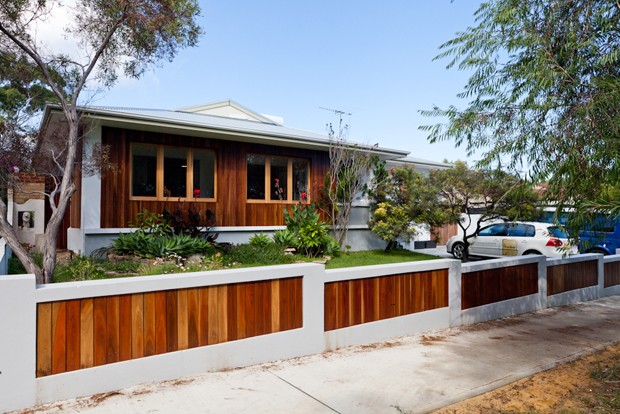
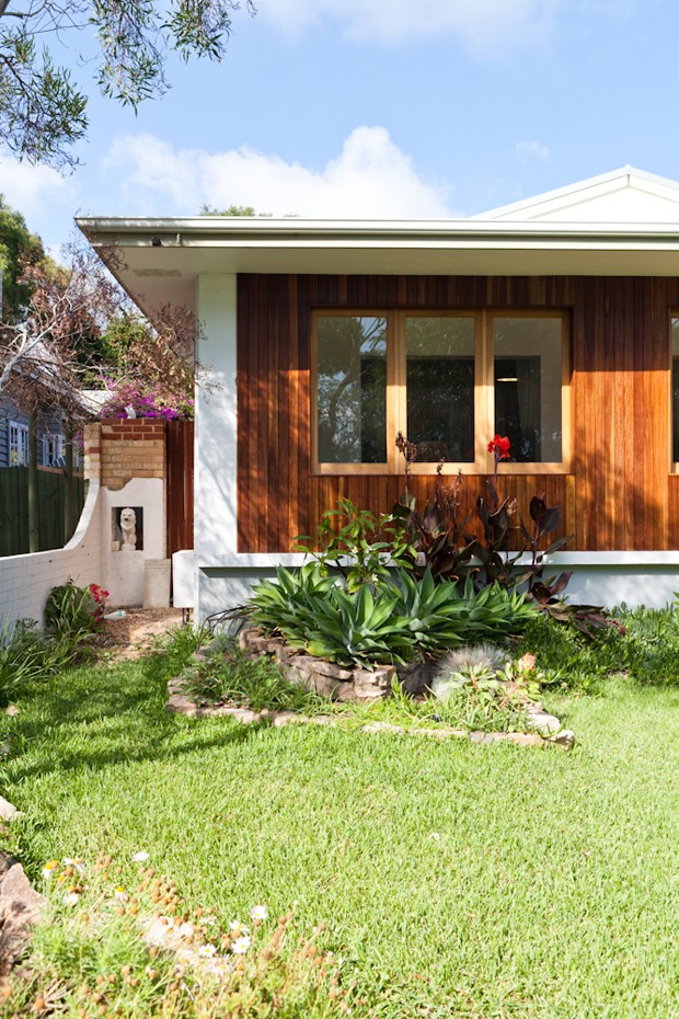
The use of wood and steel contributes to this design aim, with the floors and windows featuring Wundafloor European Oak 20mm engineered floorboards, and the façade cladded in Spotted Gum. Together with the red brick feature walls, this palette adds character and warmth while acting as a reminder of the old European-style home.
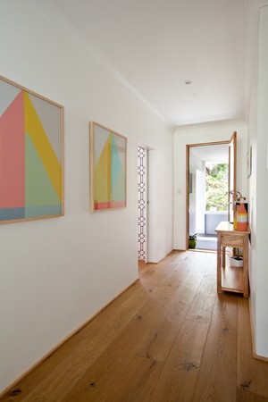
“These products were chosen according to our taste and personal style – we love things that get better with age and aren’t too perfect or precious,” explains Potter.
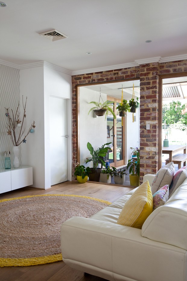
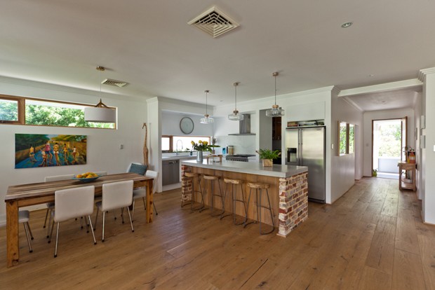
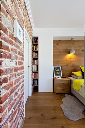 The red bricks used to construct the feature walls are recycled – some were existing under the plaster, and some had to be rebuilt to be structurally sound.
In addition to maintaining a sense of the home’s past life, the family wanted living spaces that would “worship the backyard”. The floor plan was restructured and made more open, which made way for a new scullery.
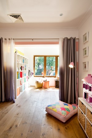
Other major changes include adding a bedroom and enclosing the front veranda to create a shared playroom for the children (pictured below). This not only encourages inter-sibling play, but also connects the bedrooms. Altogether, the renovations added an extra 64qm to the original 206sqm home, with a two-bedroom, one bathroom- studio at the back of the site providing an additional 40sqm of living space.
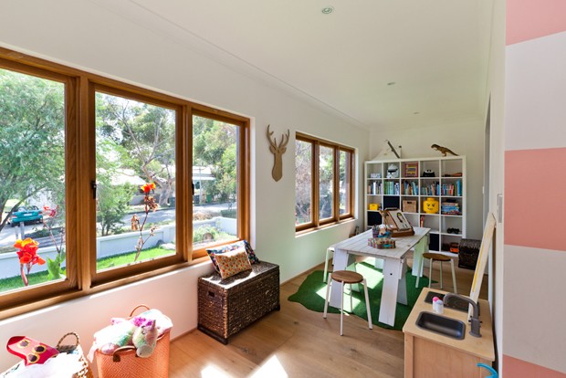
At the same time, solar heating was added for the pool, and some of the furniture has been upcycled, such as the playroom’s desk, which used to be an old door. The front windows are all angled to catch the afternoon breeze coming from the ocean, creating air flow and reducing the need for air-con.
The large windows at the front of the house were installed for winter sun, which would be circulated by the reverse fans. The north-facing front room is also double insulated and clad with spotted gum for added insulation against the summer sun.
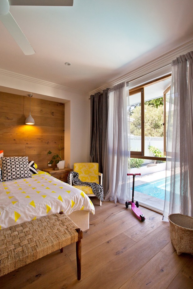
“I can see the pool the kitchen, and most places in the living space look out to the yard, giving a feeling of space and connection with the outside. Even the main bedroom opens to both the deck and pool,” says Potter.
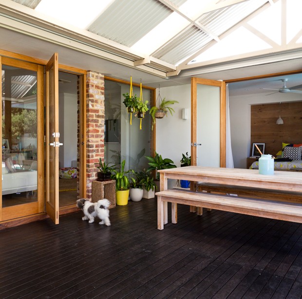
While the house has been drastically transformed, Potter acknowledges that interesting features don’t always have to be expensive.
“You have to know when to fight for a feature and know when to let it go. Some of the things I really didn’t want have ended up becoming my favourite things,” she says. “Like the brick pillar that protrudes into the lounge. It adds so much character and interest. I think I’d advise other future renovators - don’t get too caught up on perfection, as it doesn’t change how you feel in the space. And you don’t need to spend a lot of money often – my favourite features are certainly not the most expensive ones.”
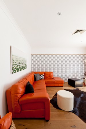
KEY PROJECT DETAILS
LOCATION: Fremantle, WA
ARCHITECT: Adrian Fratelle, Ecohabit
INTERIORS: Emma Potter, Breadbox Interiors
PHOTOGRAPHY: Heather Robbins of Red Images Fine Photography

