In a city that assumes it knows what you’re like based on where you live, the postal codes of inner-west Sydney are often seen to belong to the hip, trendy and social. The buildings lining the streets of suburbs like Enmore and Marrickville often perpetuate this narrative too, with both modern and grungy architecture that facilitate inclusion and engagement, rather than exclusivity and seclusion, highly favoured by the community.
The Eve Apartments in Erskineville, a sculpted building with 197 apartments that incorporates a European urban block precedent, is the epitome of the inner-west cool home. Situated in a regenerated portion of land that was formerly used for industrial purposes, the new multi-residential block presents an active public face to the main street and is all about conversations – getting them started and keeping them going.
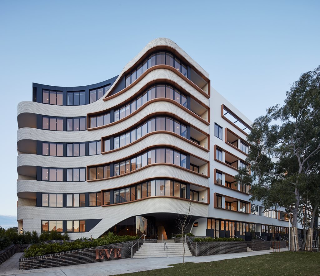
“The relationship between site and surrounding suburb is intrinsic to the project’s design language,” DKO Architecture tells us. “It is conceived, designed and shaped as a response to a range of local vernacular elements, such as the distinctive curved corner treatment of numerous local buildings, along with an honest and robust materiality.”
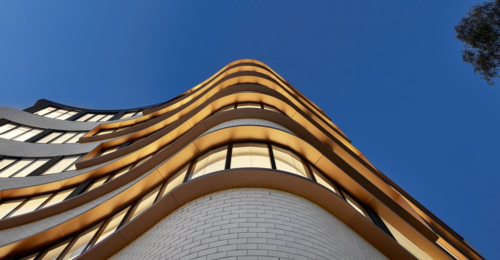
The star of the show is Eve’s southwestern corner. Here, the façade is dominated by textural brickwork that curves with a fluidity that doesn’t always come naturally for an inanimate object.
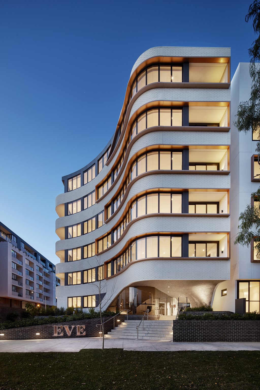 The curvaceous façade is punctured by sharply framed balcony slots, forming a dynamic interplay of vertical and horizontal movement.
This soft convex form isn’t only for show either, but makes space for an urban plaza that counters the long and relatively homogenous orthogonal built forms that line Macdonald Street. This social space, at once an extension of the public domain and a grand formal entry to the building, cultivates chance encounters and facilitates neighbourly chats.
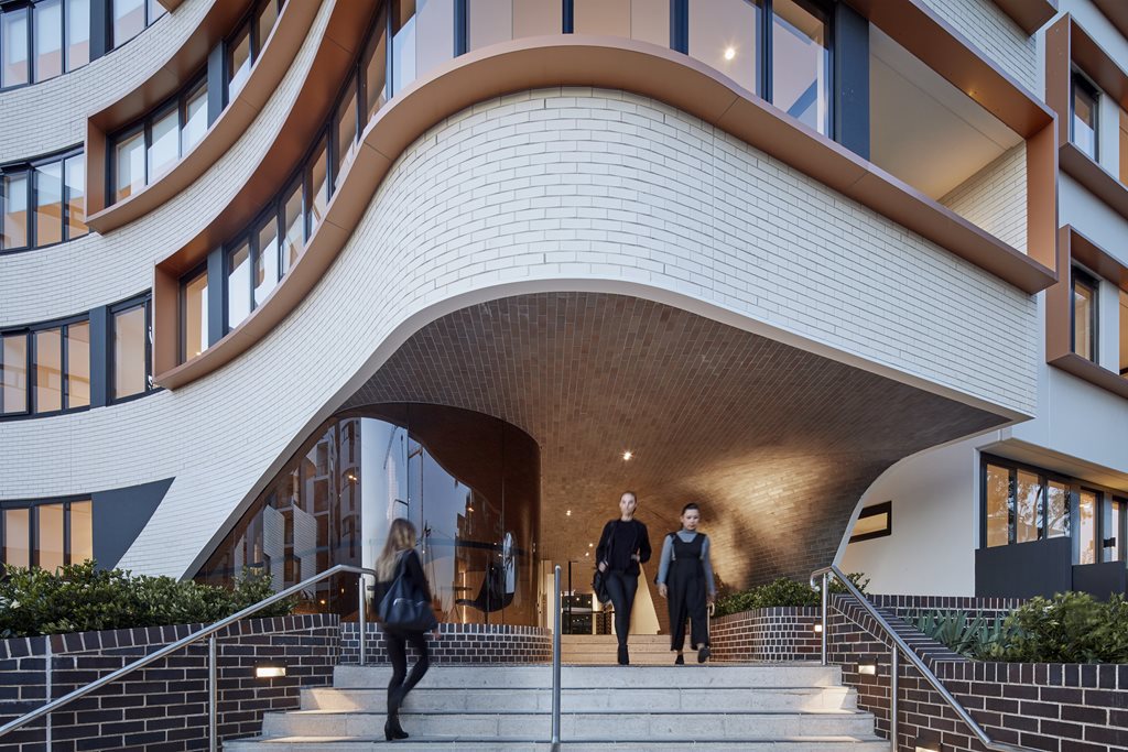 The dynamic form of the entry arch is generated by a curve that swoops up, then down to ground the brickwork.
The decision to use bricks, as well as precast concrete and metal, was informed by the qualities of adjacent buildings, and is one of a number of contextual responses to the project’s locality. For instance, it recalls the distinctive brick arch of a nearby rail underpass as well as the old brick kilns that used to exist in the neighbourhood.
The durable material palette was also chosen because it would weather gracefully, allowing the building to change with time. In addition, the architects wanted the importance of touch as a sensory experience to be evident in their work, meaning the building could not simply reside as a piece of untouchable art. The textured and tactile materials are fundamental to the success of this goal, allowing Eve to address the street at a distance as a contemporary landmark, as well as up close and intimate, as a home and a retreat.
Once again it is important to acknowledge that the Eve Apartments are not just about how things appear. Within the compounds lie a secluded but central courtyard, a 1000m2 rooftop garden and other communal spaces that come equipped with BBQ and lounge areas for residents to enjoy. These features work for the benefit of the brief, which required the provision of a place where residents can relax and recreate while feeling a sense of community.
Internal comfort is another key consideration. Eighty percent of the apartments receives solar access in mid-winter, while 90 percent features high levels of natural cross ventilation for passive cooling in summer. In fact, the incorporation of natural ventilation to the units was a key driver for the form and plan of the building, determining the number of lifts, entrance, and even the project’s external façade.
The complex geometry of the entry area posed another challenge to the team. The ceiling treatment of the main lobby essentially curves in every direction, complicating the design, documentation and construction process. However, all elements came together in the end to provide a “beautiful entry experience”.
DKO Architecture uses a number of phrases to describe the building, but there is one we believe best fits Eve: “Positively urban”.
“This must be a bold and confident building, not a precious one,” the architects declare. It is hard to fault their statement.
PRODUCTS
BRICKWORK (MAIN FAÇADE)
AUSTRAL BRICKS LA PALOMA MIRO
BRICKWORK BASE
AUSTRAL BRICKS BOWRAL BLUE
MAIN FAÇADE
AUSTRAL MASONRY, PRECAST & PRECAST CONCRETE
FAÇADE (UPPER LEVELS)
ALUCOBOND ARCHITECTURAL

