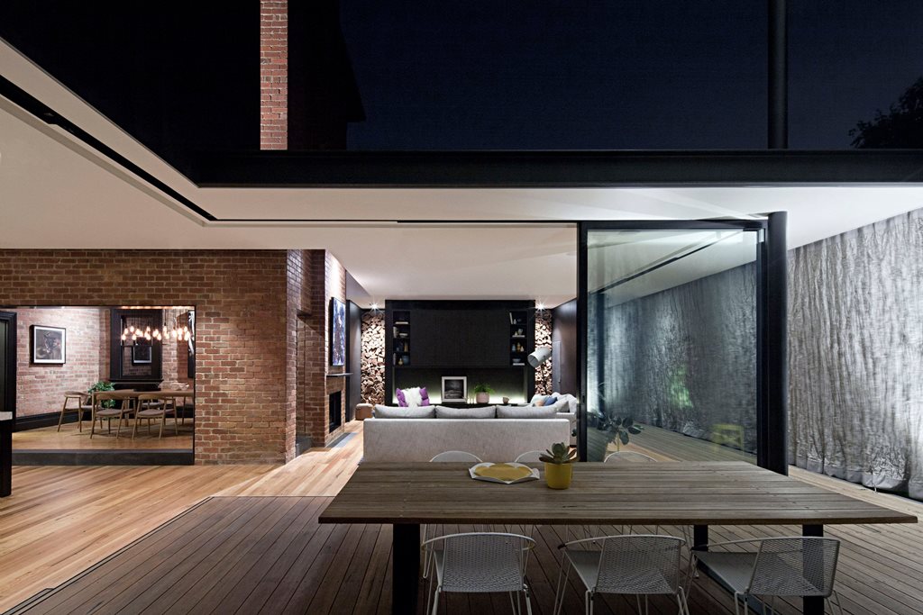
Creating a greater connection to nature is one thing, balancing a client’s desire for openness with the need for shelter is another challenge entirely. In most cases, architects revert to one of two solutions: either they incorporate canopies that are ineffectual at protecting from wind and rain, or they wrap the interior in glazed glass panels that let in light and little else.
When Matt Gibson Architecture + Design was chosen for an extension of a heritage home in the greater Melbourne suburb of Barrington, they didn’t believe either of these solutions to be adequately respectful of the existing building fabric. Their brief was to make the interior spaces more liveable, while facilitating a greater connection with the backyard. While the standalone addition of canopies was too interactive, the addition of glass would only serve to mask the heritage character of the build.
The project team, led by Japanese architect Erica Tsuda, settled on the Japanese concept of “Hiro-En”, whereby deep verandahs were added to rooms to create liminal spaces between indoor and outdoor. To limit the glare that resulted from a west-facing orientation, they wrapped the building in a stainless-steel mesh curtain; a kinetic shroud that provided protection of a more flexible variety.
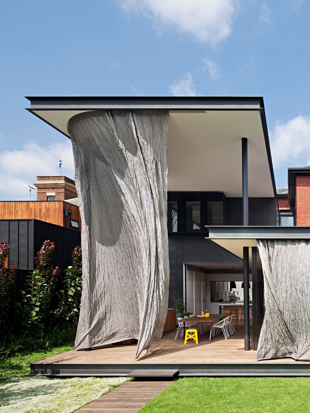
“The sculptural nature of the curtain provides a free-flowing and kinetic foil to the permanence and solidity of the heritage structure," says Matt Gibson in a design statement.
The metal mesh screen is capable of shielding against both rain and glare, but is supplemented by sliding walls that provide more solid protection when necessary. The project team used computer modelling of sun patterns for optimal placement of these elements. This technology also helped the architects to determine the various canopy heights.
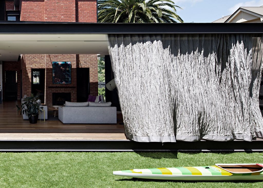
In order to create more liveable interior spaces, it was first necessary to remove a previous home extension. Rather than increase the area of the home, the architect’s intention was to reconfigure the existing floorplan to make spaces more flexible and interactive.
Original materials and structural elements were kept wherever possible. External brick walls that had been pushed back into the floorplan were re-used as internal partitions, while spaces on the border of old and new elements were filled with glazing. Not only did this allow a more seamless transition between areas, it also brought sunlight deeper into the floorplan.
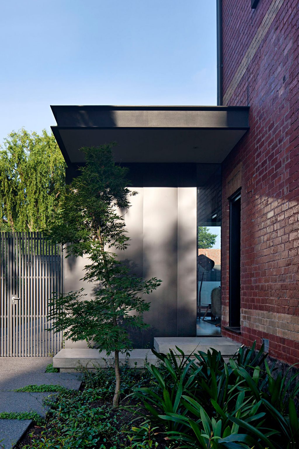
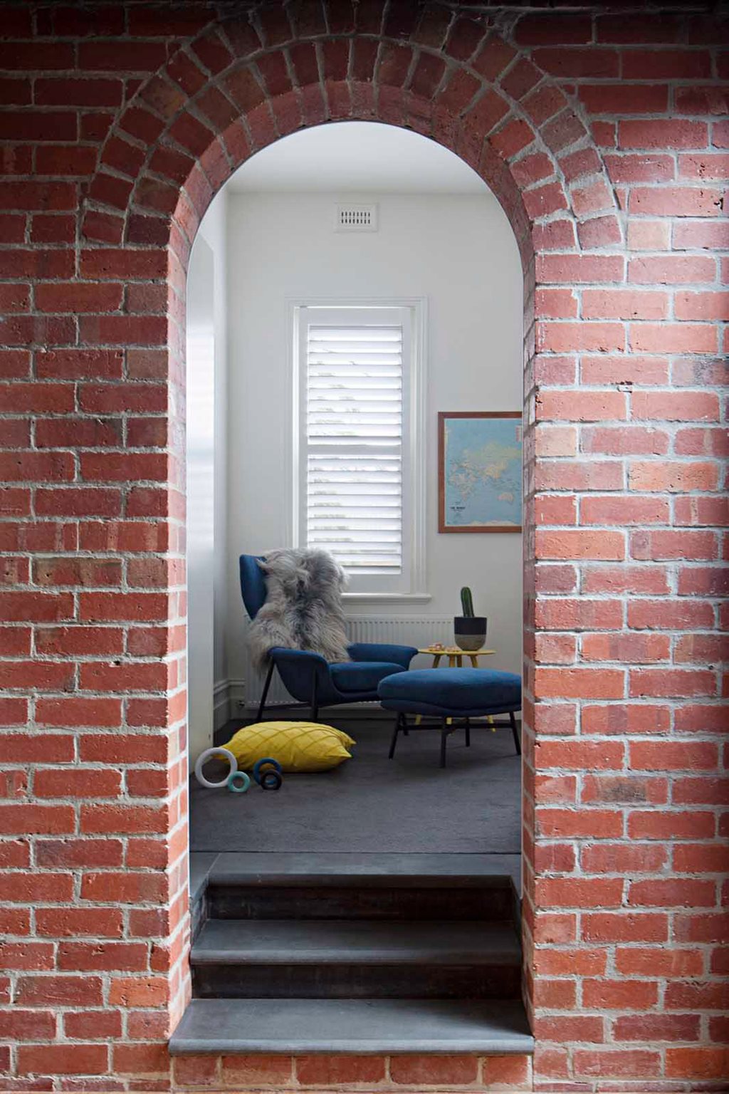
“The contemporary addition challenges the concept of building low-quality, replica additions that attach themselves to the heritage fabric and in effect compromise, confuse and diminish the integrity of the original,” says Matt Gibson in a design statement.
“The intervention here is instead contemporary and interactive, activating and opening up the compartmentalised interior to previously under-utilised green space. [At] the same time, it [preserves] and [augments] the cultural significance of the original building.”
