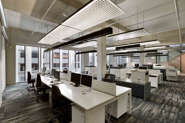
When a graphic design and publishing company was seeking new headquarters, it realised that it could take advantage of the shift and cement its values into new office premises. As a result, the brief it gave to Zen Architects warranted a building that would be representative of its brand and clientele’s focus on sustainability.
Today, the Carlton Graphic Design Studios is a renovated 1980’s building and site which has been transformed into a positive and sustainable workplace. A new upper level has also been added, increasing the available floor space.
The single largest contribution to sustainable design in this project was retaining the existing building, instead of demolishing and replacing it with a brand new structure. This negated the energy and resource demand that would otherwise have been required in constructing entirely new premises, reducing the project’s carbon footprint.
From the outset, the architects recognised the building’s potential, and realised that in terms of amenity, contribution to the street, and operational energy use, it had many opportunities for improvement.

An obvious change is the building’s new operable façade, which provides adjustable shading for operational energy savings, and was installed to reduce solar heat gain and glare.
In addition, the internal linings, ceilings and building services of the original rooms were removed and replaced with efficient service systems and equipment. Combined with minimal coverings and linings, this created a more open and less pretentious environment. A natural material palette was also favoured by the architects.
Since moving into the new site, the client has reported an increase in productivity levels, and received positive feedback from their customers, demonstrating that sustainable upgrades can add value to a business.

INITIATIVES
-
New operable façade was introduced externally to the west street, featuring twenty pivoting vertical fins of perforated metal. It provides adjustable shading for operational energy savings, flexibility for occupant privacy view, and gives the building a cohesive identity and active, permeable interface
-
The operable façade manages daylight and solar heat gain
-
Exposed thermal mass to balance thermal loads
-
The new upper floor is pulled back off the eastern boundary for increased amenity, increasing daylight access and allowing cross ventilation
-
Internally, the building was stripped back and fitted with new service systems for improved operational use. This includes energy efficient HVAC systems zoned for maximum efficiency, energy efficient hot water system plus recirculating hot water lines, and energy efficient artificial lighting with combined automated and user control
-
Rainwater collection for toilet flushing
-
New internal linings were avoided for honest materiality
-
Low VOC materials were used for clean indoor air
-
Bicycle accommodation and showers
-
Landscaped roof terrace and timber decking insulating external slab
-
Informal review of energy use after the first six months indicated a NABERS whole building rating of 4.5 stars
Images: Emma Cross

