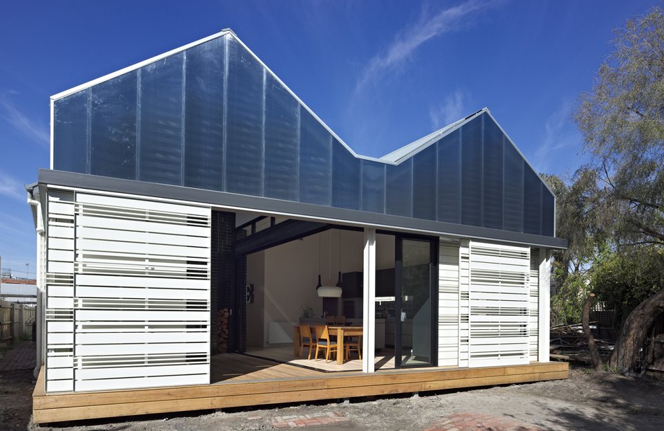
MAKE architecture has won the Single Dwelling (alterations & extensions) category for a House Reduction in Abbotsford which successfully caters for a large family through multifunctional rooms within the constraints of a smaller footprint.
The brief was a renovation to an inner-city double fronted Victorian weatherboard home where the clients wanted minor alterations to the existing fabric of the house but needed additions such as new bathrooms and a new kitchen, living and exterior decking areas.
Owner and Director of MAKE architecture, Melissa Bright accepted the Award on behalf of the firm.
"It is such a privilege for our small practice MAKE, to be recognised in this way. We've only been going for six years which feels like a long time but we're really only just starting out still and to be recognised at these awards is a thrill.
She said that the approach of MAKE has been to minimise consumption and creating smaller environments.
"In terms of sustainability we're really trying to think about sustainability in a different way. A lot of our clients can't afford add on products and their budgets are small so we try to think in terms making things smaller."
The judges were impressed with the innovative way that space is utilised and made flexible.

"Interesting, compact architecture, this project is a rare recognition of the fact ‘smaller is better," the judges said.
"The effort put into reusing demolitions materials is no token gesture and the occupants are given the ability to be responsive to climate and day and night conditions."

The judges added: The occupants are given the ability to be responsive to climate and day and night conditions. As Rick Leplastrier says, "A sustainable house is like a yacht - to sail it properly you need to be actively trimming the sails and working the sheets." This house allows such fine tuning to happen very well."
The architects have achieved this flexibility within the house by using moveable walls, retractable doors and maximising the efficient use of joinery and built in furniture.

The house has been oriented for maximum solar gain and cross ventilation has also been carefully considered with high level louvres positioned in the kitchen/dining area to vent the house in summer.
Located in a dense, inner urban area, the efficient planning of this house has meant that there was an actual reduction in its internal footprint.
One of the biggest challenges outlined by the architects was devising an efficient plan to accommodate a large family within the constraints of a smaller footprint. The design was conceived as a space that supports family life events, and the spaces were made to work hard to allow the functions to overlap and respond to shifts over time.

INITIATIVES
-
Reducing the size of inflexible spaces such as lounge / dining / bathroom.
-
Using multifunctional spaces for smaller spaces to expand and contract into. The deck/outdoor area is a second TV room in summer or an extended dining room for entertaining.
-
Using screens / moveable walls / retractable doors to provide flexibility and adaptability.
-
Maximising efficiency with the use of joinery and built in furniture (day beds / seats / desks).
-
Making rooms do many things – overlapping and cross programming. For example the kitchen can work as study/library/second living room, with the function shifting depending on the time of day.
-
Introducing flexible undefined spaces eg. studio/ granny flat / home office / teenage retreat
-
External screens can be closed for a shady refuge.
-
Water collected from the roof is re-used in the laundry and WC.
-
A fan in high ceiling space is used to work in summer / winter mode (circulating warm air down in winter) minimising heating requirements and negating the need for air-conditioning.
-
The existing house insulation has been upgraded throughout and the rear of the house includes under floor insulation to reduce energy requirements further.
-
The house has been oriented for maximum solar gain and cross ventilation has also been carefully considered with high level louvres positioned in the kitchen/dining area to vent the house in summer.
-
The sliding screens across the decking area protect the house from the busy road at the rear of the property while also allowing for the shading of the house from summer sun. Their sliding design means that they can be completely closed to allow the passage of winter sun during the day and then protection against heat loss during the night.

Photography by Peter Bennetts
+2012+winner%3a+MAKE+architecture+for+House+Reducation+%7c+Architecture+%26+Design&pu=/awards-1/past-awards/2012-winners/make-architecture-win-this-year-s-single-dwelling&pt=_Article)
+2012+winner%3a+MAKE+architecture+for+House+Reducation+%7c+Architecture+%26+Design&pu=/awards-1/past-awards/2012-winners/make-architecture-win-this-year-s-single-dwelling&pt=_Article)