
Week 20/23: Cold comfort / Venice Vernissage / Jean culture / Inaccessible accessibility / Bookends: Green architecture / Signs off
In the 2023 budget the Federal Government says it is going to spend $1.3 billion to set up the Household Energy Upgrades Fund, which will provide $1 billion to the Clean Energy Finance Corporation to finance home energy upgrades for around 110,000 households.Week-19-23-Cold-comfort-Venice-Vernissage-1732061493.png

Cold comfort: energy efficiency fails

In the 2023 budget the Federal Government says it is going to spend $1.3 billion to set up the Household Energy Upgrades Fund, which will provide $1 billion to the Clean Energy Finance Corporation to finance home energy upgrades for around 110,000 households.
Sounds good. Which it is, not because it will lower energy use (which it won’t), but because it will make 110,000 households more thermally comfortable.
You see, our houses are so thermally inefficient that most residents are thermally uncomfortable, especially in winter. We have the world’s worst climate-adapted houses, particularly given our benign climates. Years of research by Terry Williamson at the University of Adelaide has shown that, when the thermal performance of a house is increased, the residents actually increase their energy use, as they are now able to heat more of the house, and to an improved comfort level.
It's a win-win: better insulation and double glazing will make many residents feel warm and cosy in their houses next winter, but will also make some Canberra politicians feel the same way about themselves this winter. But it won’t address climate change.
Venice vernissage

The Venice Biennale opens with its ‘Vernissage’ today. Only the third in thirty-two years that I will miss, but there are many Australians amongst the throng, getting their sugar hit of architectural media along with prosecco and prosciutto. This year’s overall theme, set by curator Lesley Lokko, is “Laboratory of the Future”, and the advance hype is that Africa features bigly, to use my favourite Trumpism.

In the Australian Pavilion (the DCM one that replaced the Cox one) is “Unsettling Queenstown”, featuring the Tasmanian mining town as an example of a settler town “built on resource extraction and labour exploitation”.
The curatorial team (Anthony Coupe, Julian Worrall, Ali Gumillya Baker, Emily Paech and Sarah Rhodes) say the exhibit “ponders the post-colonial future of this town and similar examples around the world… and explores ideas of decolonization and decarbonization, coupled with regeneration and revitalization”.
All I ask is that some lucky Vernissage-iste sends me a photo of the “immersive experience with a floating “ghost” in Tasmania’s colonial history” for next week’s AAT. Hope it meets the hype.
Where do Denim Jeans come from

The latest big move in fashion is to recycle denim jeans, particularly in the USA, thought to be the home of that culture. But let me disabuse you of that notion: denim is a corruption of ‘de Nîmes’, the label stamped on the side of crates shipped to the USA bearing the hardy blue cloth. The southern French town was, and mostly is, a centre of textile trade. Intended for the workers on the newly opened goldfields in the mid 19th C, the cloth was fashioned into rugged working man’s pants using a pattern developed in the Italian seaside city of Genoa.
‘De Nîmes de Genoa’ becomes denim jeans. The yanks have an innate ability to mangle French. Nôtre Dame becomes Note-a-Dayme. Boise becomes Boy-see. Entrée is the main course. It’s in their genes. Boom tish.
Inaccessible Accessibility
We address accessibility issues better these days. Or are we? Despite having the well-used AS1428, and the exigencies of the national DDA, we seem to forget the fundamentals. Here’s a few of my pet hates. The first is not making access to buildings the same for all. The second is assuming accessibility is only about wheelchair users, ignoring those with prams, walking sticks, making deliveries and so on. Why not design for everyone, everywhere?
Thirdly, ignoring other disabilities: poor eyesight, blindness, deafness, limbless and many more. They need not be held back, except by poor environmental design. Witness the great work by Graham Innes, former NSW Disability Commissioner, and Nas Campanella, ABC journalist on disability issues, both of whom are blind, and both of whom campaign against ignorance and stupidity.

Fourthly, stupid words and signs. It’s accessible, not disabled (when you repaint the correct symbol why not disable the disabled sign). All public signs, even those that refer to a non-existing ‘button’, need to be in braille, including wayfinding markers.
My final gripe is that many of our modern buildings are entirely unsuited to people with poor eyesight, poor spatial awareness, or who are mobility challenged. The buildings are poorly laid out, without thinking about all of us: 1 in 6 (18%) people in Australia – or about 4.4 million – have a disability. Think about that, and them, and us.
Bookends: it’s too easy being green (architecture)

Green is good, so they say. Green architecture is better, so they say. And they say it so much, there is a multitude of books on green architecture, called Green Architecture. To misquote Kermit, it’s not easy being (a) green (book editor); and thinking of an original title.
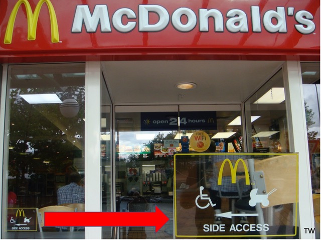
Sign off the times

Our sign off this week also features that certain well-known fatty fast-food outlet, using yellow (and Red Rooster red) as its themed colour. It seems that yellow is also the chosen colour of the road safety designers - I just wonder what they are warning about?
Tone Wheeler is an architect / the views expressed are his.
Short pieces are published every Friday in A&D Another Thing.
Longer columns are Tone on Tuesday, published then.
You can contact TW at toneontuesday@gmail.com.
- Popular Articles
