Last week I described Australians as GALAHs: Greedy And Lazy And Hateful; and how these characteristics have created a society with little support for good design. This column expands that idea to show how GALAHs directly give rise to our mediocre cities.
And they are mediocre: Robin Boyd’s Australian Ugliness rings as true now as it did in 1960. Now, as then, it is not highlighting the very worst of our cities, but the poor quality of the vast majority.
Whilst not saying that everything in our cities is crass - we have a fine tradition of making great public monuments, in what Leon Krier calls the ‘Res Publica’ - it is the vast bulk of the ‘Res Economica’, the everyday built environment of housing and commerce that makes our cities so mediocre.

Our society may say it cares about quality, green, equity even, but when ‘push comes to shove’ the lived experience is very different. The briefs, the budgets, the intent for our everyday buildings are ordinary at best, mostly inferior. Here’s some evidence.
HOUSES
Our new houses have been the largest in the world for over twenty years; that they’ve shrunk a little to 235 square metres on average is no cause for celebration. Aussie homebuyers love McMansions; the only thing better than a large house is a huge house. This greed for unnecessary space crowds out sunlight, privacy, landscape, gardens and neighbourly setbacks. The bonus is the lazy have less lawn to mow.
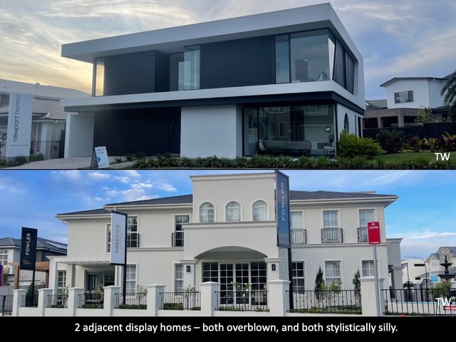
And the hubris of individualism extends to ‘style in the street’. Take these two display project homes in the new edition of ‘Homeworld’ in Sydney’s north-west. They may look very different, but they share a lot in common (no pun), aside from being built next door to each other. They have the same basic failings: oversized with wasteful spaces, completely agnostic to site and climate, and they misuse the ideas behind the styles they parody (minimalism in modernism, rationalism in Classicism).

One more story of greed: some years ago, Cosmopolitan Homes (now defunct) offered a ‘green’ project home, the Aquarius, designed by Allen Jack and Cottier. Best of intentions, quality designer, serious Green Pack, goes on display and wins several awards. So far so good. The list price of the base home, without the Green Pack, was $300k. The cheapest of the 200+ they sold, was $450k, as they were all bulked up with ‘lifestyle improvements’ (extra rooms and garages, bigger kitchen, more bathrooms). But not one chose the Green Pack upgrade. Not one.
HOUSING
Customer demand has created new suburbs at the city fringes with ever smaller blocks with ever larger individual houses, whose dark roofs almost touch. But they are separated - that’s the key - it’s your own, no sharing. Something in Australian folklore has made us wary of any form of community living in flats. Rugged individualism is writ as home ownership; and it has a whiff of hatred of communal living about it.
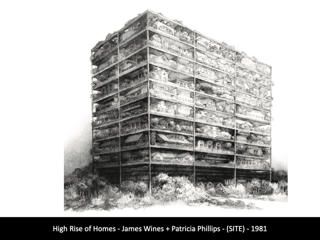
When we did start building some multi-housing in the 60s it was as cheap gimcrack as possible: the flats were intended solely as rental investments; the apartments were for young buyers as a step to a ‘real house’. Neither got a decent brief or decent design. Compared to the mid-century apartments in Europe and the USA, ours were decidedly low-grade and non-communal, seeking to be like a stack of individual houses as parodied by James Wines and Patricia Phillips of SITE in their memorable drawing.

So bad was the tradition of poor design quality that 20 years ago NSW introduced an Apartment Design Guide to lift design standards. And it did. But arguably it swung the pendulum too far, creating complex designs with difficulties in construction, which the many ‘get-rich-quick’ developers failed to address in their rush for profits. Hence the recent introduction of a Building Commissioner; totally un-necessary if developers were focussed on providing good dwellings rather than making profits from property.
SCHOOLS
We have privatised high-school education, with the highest proportion of fee-paying schools in the world, one of the key drivers of increasing inequality in Australia. And the designs for those private schools exude the excess that the wealthy, but conservative, parents would want. Pastiches of the pomp of Eton and Harrow.
Even when they try to push the boundaries other than backwards, the results are as gauche as boaters and blazers in the Australian heat. Meanwhile the public schools languish, as discussed in ToT 124 on Cranbrook vs Cranebrook.

SHOPPING MALLS
Shopping Malls are said to have been invented by American architect Victor Gruen, in part to protect from rain and snow. They could also be said to have been perfected as ‘shopping centres’ in Australia by Westfield, where the climate driven need was not as strong as the desire for control and profit. So successful was Westfield (and its management Scentre Group) that they exported the designs and management back to the USA (and the UK and elsewhere).
Shopping is often defined by street culture, think NY’s Fifth Avenue, Tokyo’s Omotesando, or London’s Oxford Street. In response many malls in the USA have developed a hybrid mode of internal mall and external shops on streets, particularly on the west coast with the design creativity of Jon Jerde.
But in Australia we have doggedly stuck to the original idea of internalisation, with an excruciating external urban blandness. We amplified the original USA shopping mall throughout our suburbs, being both big (Chadstone in Melbourne, owned by Vicinity Centres, has 500+ stores), and continued the original idea of being fully enclosed, hyper controlled, and often surrounded by hectares of hot concrete and bitumen.
They may be wildly profitable, and customers love them (especially the air conditioning in heat waves), but they do little to add the sense of urbanity and society in our cities.
HOTELS
We call them pubs, but any similarity to the ‘public living room’ of an English pub is illusory. We do beer barns mostly in the suburbs; in the cities the smaller pubs which could create some communal atmosphere have a ‘VIP room’ shoved into the mix - with smokers losing their loot in the pokies. Not only are we robbing the ‘lazy -winner’ lot blind but we are doing it in rooms of unspeakable design squalor.
AGED CARE
Just after the Royal Commission into Aged Care Quality and Safety was handed down in 2021, I wrote a column about the summary (the sector is entirely too profit-focussed) and the recommendations about design that were destined to be ignored.
In short, a ‘nursing home’ was neither, it didn’t have nurses and it wasn’t designed like a home. Whilst the former is being addressed (with migrants who are shockingly badly paid) the latter cannot be addressed quickly as we are stuck with facilities that were designed years ago and there are not the funds to upgrade them.
My last point is personal: my mum is in one now, bless her 96-year-old socks. It is a recent build and one of the better ones. In my quest to find her I saw some shocking ones, that no architect could contemplate their mother being in. There are internals that I never want to see again.
IS IT REALLY THAT BAD?
I doubt that I have exaggerated how bleak our culture is, and therefore its impact on design. Last week’s column elicited the most positive responses I have ever had. I received many more examples, and some commentary that went much further than mine. Then again, I am not on ‘socials’ so the troggs and trolls stayed away.
And there are rays of design sunshine. Just as many Australians forego the greed and the laziness and the hatefulness to work for the poor, dispossessed, homeless, and ‘the other’, so many younger designers are working to improve common design, but their good endeavours are at the margins, as is much of their built work.
Whilst Australia has many fine things, a positive design culture for the everyday built environment is not one of them.
Tone Wheeler is an architect / the views expressed are his / contact at [email protected]

