Created within an existing building at Monash University, Kennedy Nolan Architects has created a number of formal and informal learning spaces within the Centrally Managed Teaching and Maths Learning Centre at the institution, known as building CL28. The spaces have been devised in an effort to provide social spaces that facilitate student engagement; places to encourage learning, creativity, collaboration and engagement with community and industry.
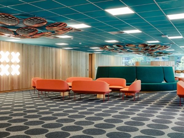
The brief provided by the university asked for student lounges that could cater to a diverse range of students, whether they be introvert, extrovert, solo workers, group workers, students working in a formal or relaxed fashion. Kennedy Nolan were careful in their approach to furniture curation, considering how certain pieces of furniture and their subsequent arrangements could support in intimate or convivial formats and to make provision for alcoves with soft acoustics and lower lighting as a refuge from more social spaces.
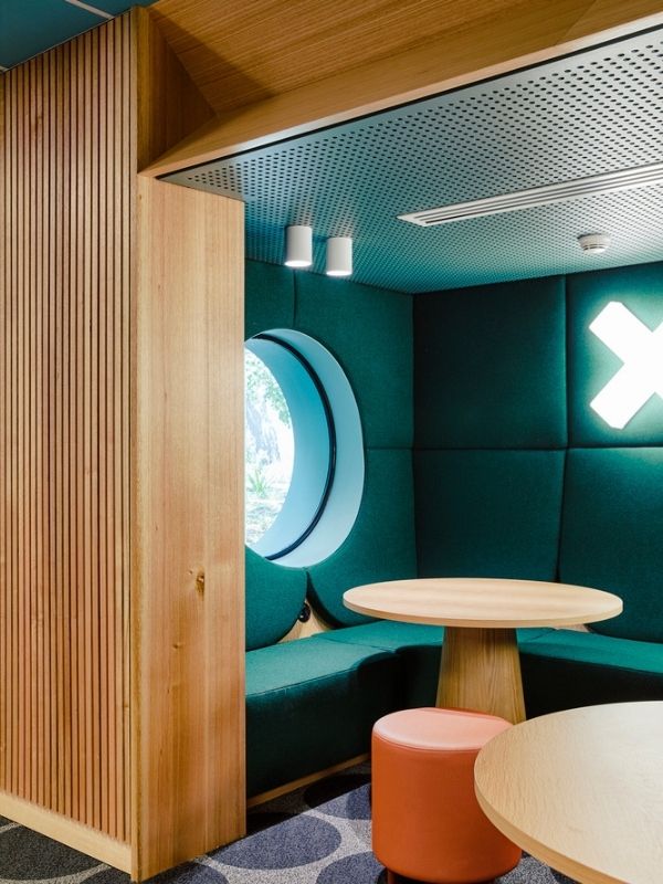
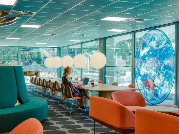
The practice were required to create a space that was specific to the requirements of the departments housed within the building, including mathematics, earth, atmosphere, and environments, but not so overt as to render the facilities redundant if they were required for another faculty or student cohort. The references are subtle without being completely obvious.
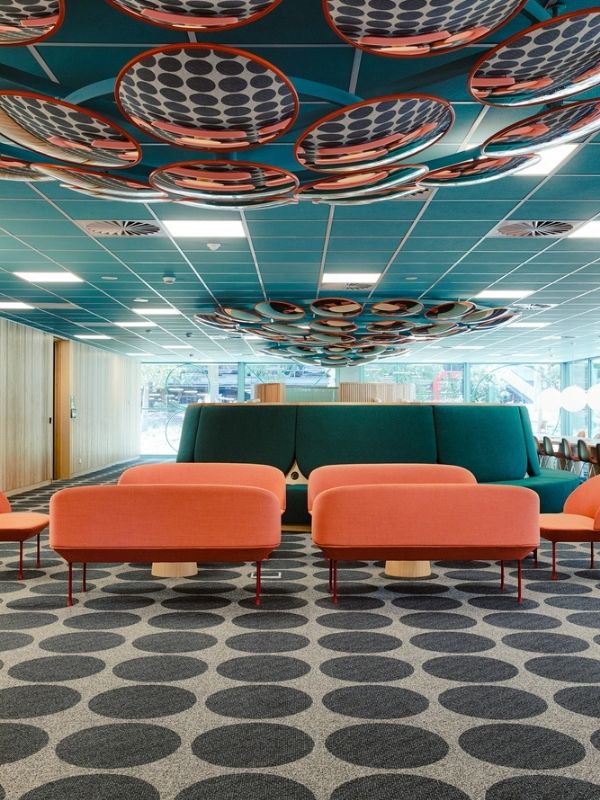
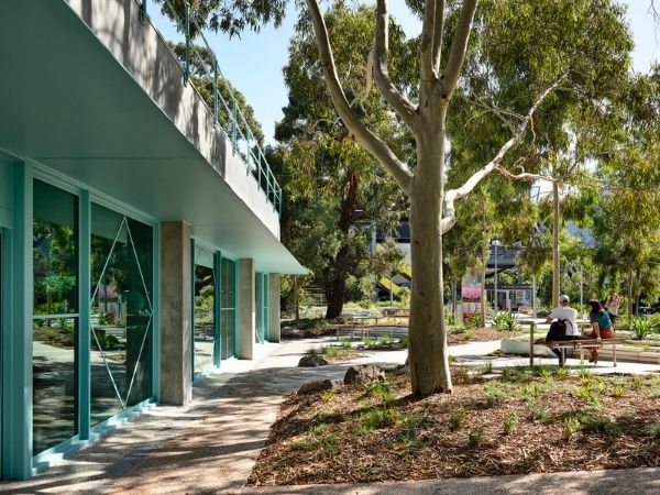
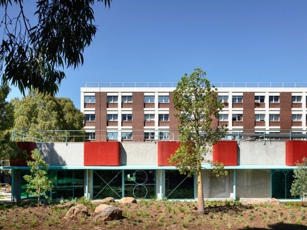
Kennedy Nolan’s design aims to be warm and inviting, providing respite from institutionalised classrooms and learning spaces. Timber provides much of this warmth, with upholstered furniture bringing a sense of cosiness. The project has had a broader effect on the campus too - radically opening up the previously blank walls of the university server and presenting a warm and reassuring lightbox at a key entry point to the campus from the main car park. The design connects to its adjacent landscape as opposed to shying away from it, as well as the university on a physical and visual basis.
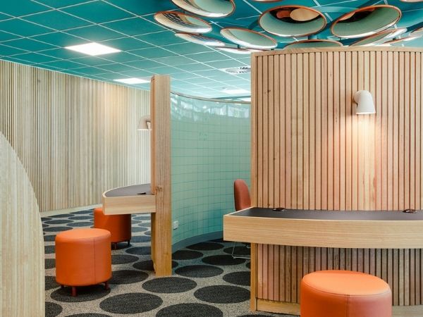
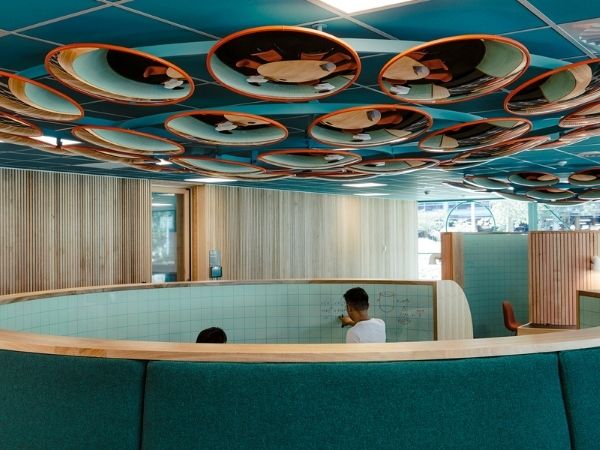
The new design expression is responsive to the existing building’s austere, functional modernism – rational planning, cartesian geometry and a limited material and colour palette. The design approach aims to speak to those who will utilise it mainly with elements that are familiar and engaging, but not so obvious that they would alienate other users. New glazed facades which incorporate playful mullion geometry and an entry portal which is an abstraction of the Pi symbol are examples of this. The use of graph-paper gridlines on internal glazing and whiteboards softens their appearance and also provides a useful armature for calculations, while the colour scheme references the graph paper used by students in the faculty.
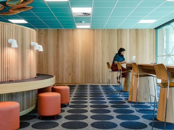
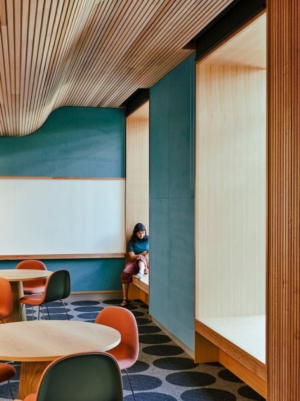
Kennedy Nolan Architects have sought to create a space that is distinctly mathematics-inspired, without alienating the other students on campus. An inviting and innovative learning space, the practice has refreshed the building to ensure it caters for learners of all types.

