Trying its hand at a commercial project for the first time, interior design practice McCluskey Studio has unveiled Collingwood Medical, an oasis of sorts away from the hustle and bustle of Melbourne’s CBD.
The subject of a collaborative design approach between client and practice, the medical centre of the utmost quality, with the technical detail required for a project of this type. A sense of calm was to be imparted on the space, being essential to the aesthetic and overall feel of the practice.
Unfolding over two levels, the medical practice comprises a number of private treatment rooms, meeting and boardrooms, and public areas such as reception, waiting rooms, staff kitchen, and break-out
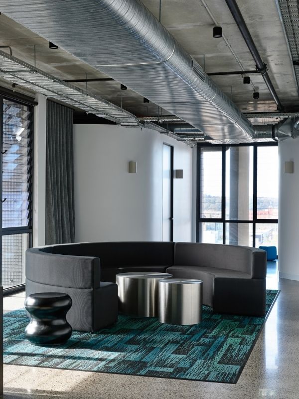
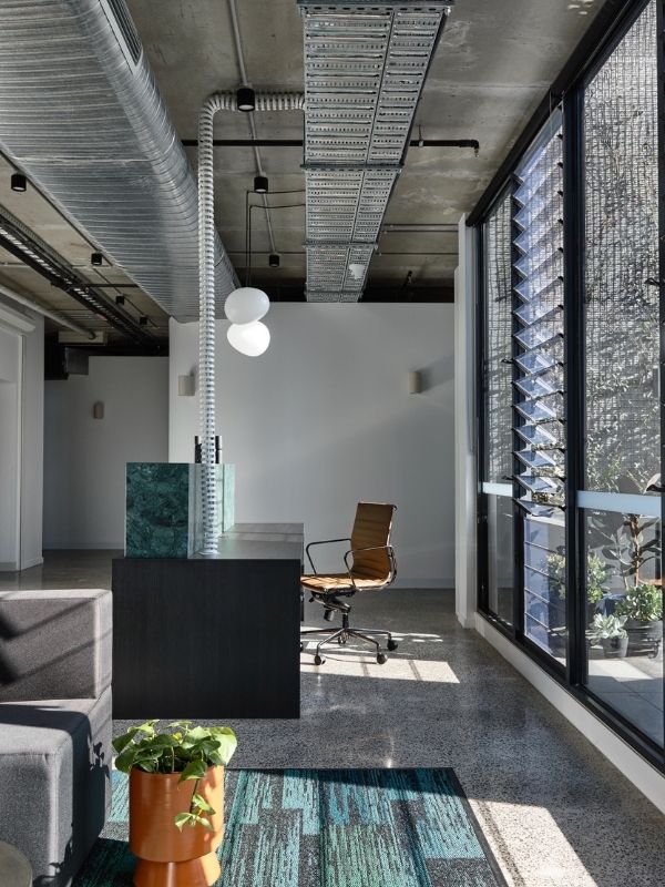
spaces. The use of both tactile hard and soft surfaces balances both design aspects, with contrast between light and dark continuing throughout the medical practice, delivering moments of serenity.
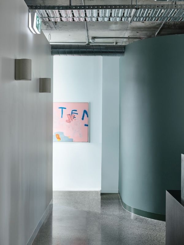
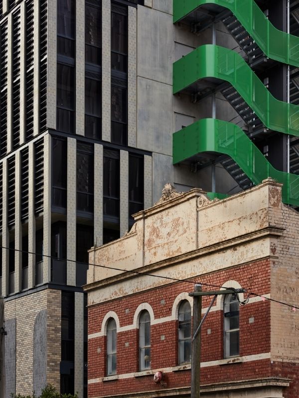
Colour has been adopted by the practice as a transformative element. Soft green walls seen throughout the practice are accompanied by a deep green natural stone at the reception desk. Green nuances help to connect the interiors to the architecture, with a green stairwell running along the exterior of the building and courtyard terrace, furthering the idea that nature and wellness is one and the same. The white corridors juxtapose the green, tying together public and private spaces, with the waiting rooms of a darker colour. Pops of colourful artworks play off the buzzing streets nearby, without distracting from the calm and thoughtful tonal and material palettes.
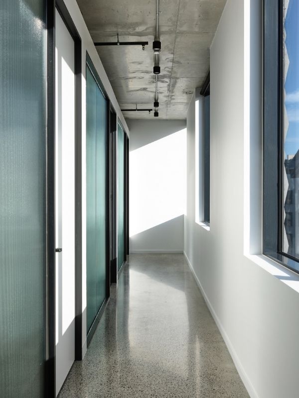
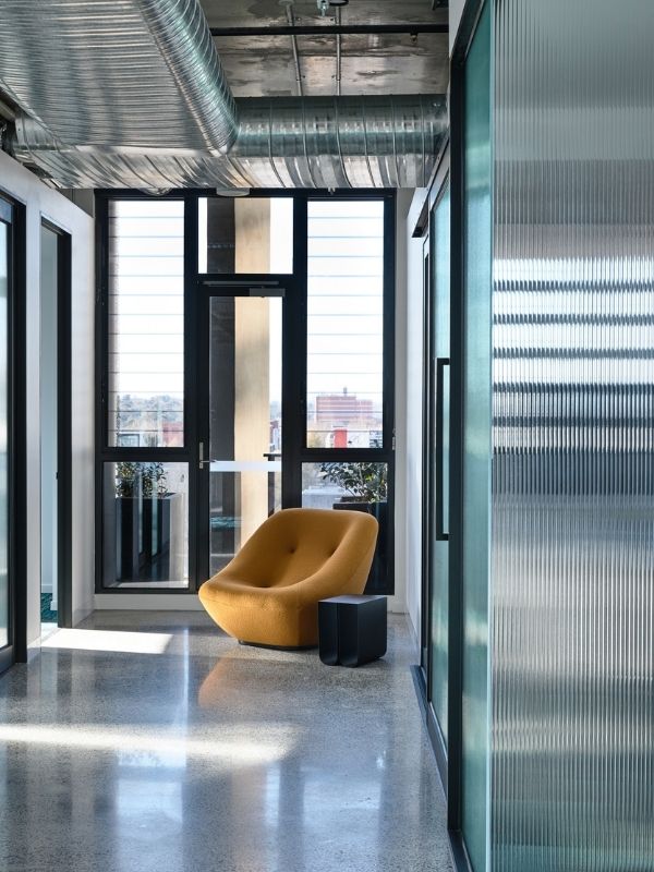
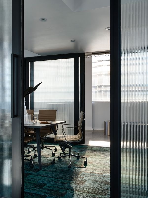
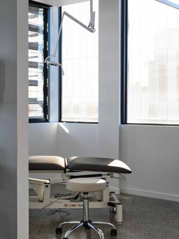
Many of the treatment rooms are awash with natural light, thanks to the implementation of fluted glass that captures the glow from windows that wrap the building and ultimately connect the interior to the skyline outside.
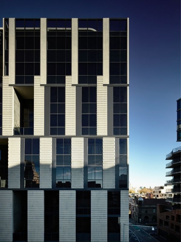
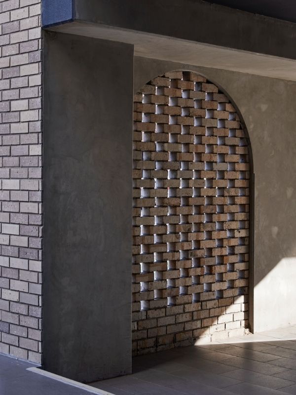
An internal pod structure cocoons with curved walls leading to treatment rooms, giving the space a sense of understated elegance. Circular couches, coffee tables, and sculptural organic-formed lighting continue the implementation of soft geometrical pieces, visually bonding the interior spaces with the external architectural arches.
With a number of adversities, including two separate levels, high foot traffic, an intersection of space and the need for durable materiality, McCluskey Studio have responded with aplomb. The practice has aimed to nurture the wellness ethos in a space that allows one to take a much needed moment to breathe before stepping back into the carnage of the city. Responding to a brief in a fashion that is distinctly theirs, McCluskey Studio have devised a thoughtful, functional and enduring design solution, that will ensure the space remains fresh for years to come.

