From the architect:
Penta is a 155sqm café in Elsternwick Melbourne, Australia.
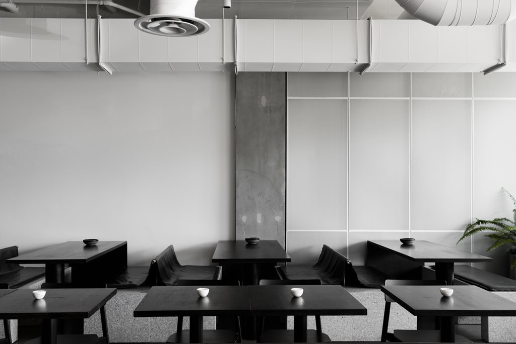
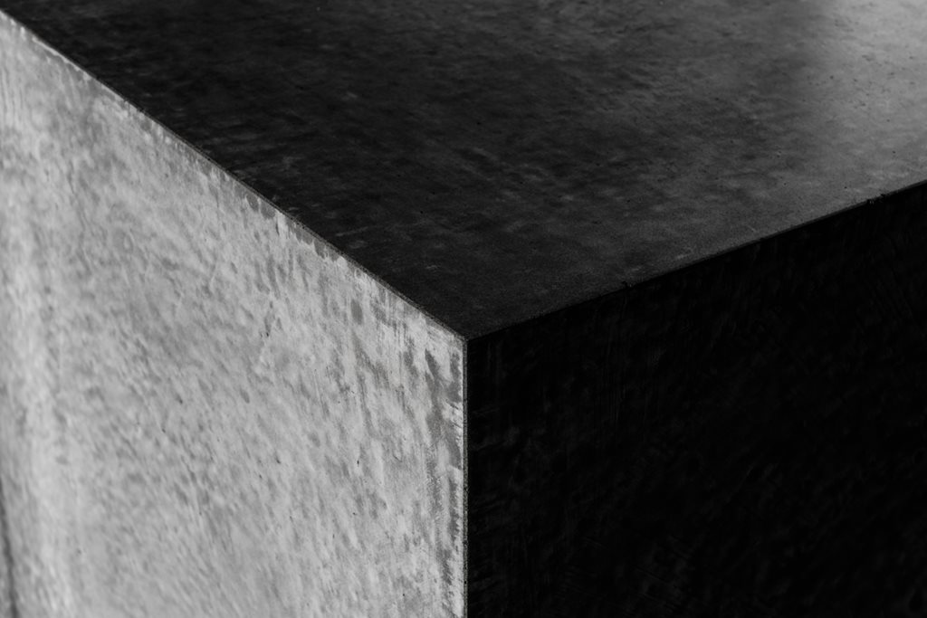
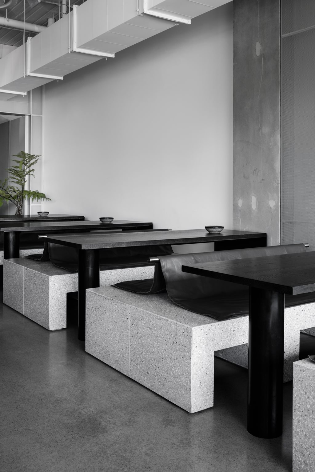
A polished grey concrete floor plane is lightly ground back to expose loose ends of aggregate. Orthogonal concrete elements rise from this floor creating a coffee and waiting station, married with terrazzo clad plinths, which form seating.
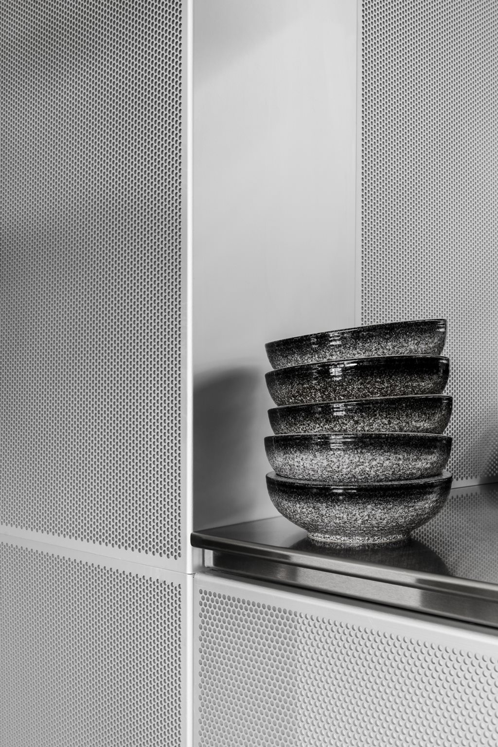
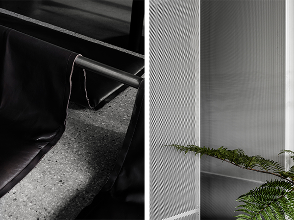
The walls are clad in a veil of perforated aluminium that folds itself across the creases of the walls. Screening the kitchen and a smaller private dining area. Light is balanced within the metallic apertures.
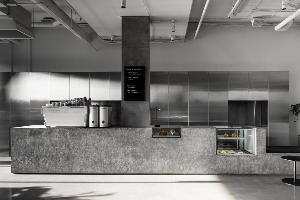
Conceptually, interior space is suspended at the horizon line between the two opposing elements of concrete and air. The heaviness of the concrete ground plane is juxtaposed to the mass of nothingness – the perforated metal cladding.
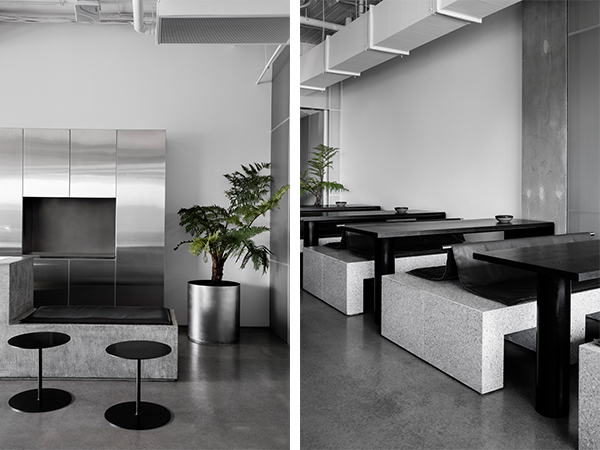
Deep cigar leaf coloured leather folds itself loosely over stainless steel rods creating a cushioned finish to the masonry plinths, whilst fern trees dot themselves around the café casting leafy, fibres shadows across interior metal skin.
BRIEF
We were approached by our client to create an eatery that honoured the food offering a colourful display of seasonal dishes. The dishes on offer are given a muted and distilled background to allow them to be the real stars. We took this opportunity to push the limitations of what people would otherwise expect both aesthetically and experientially from a hospitality venue. Excellent interiors are masterful in light and shade, curating the subtle contrast of textures and materials. Penta was certainly an exercise in all these things. The burnished concrete floors and silvery terrazzo banquettes are juxtaposed by the playfulness of the draped leather banquette cushions and striking pop of colour the Australian fern adds to the cafe.
Sun light fills the main dining hall and the high ceilings echo a sense of grandness, whilst the communal dining at the rear is clouded in a midst of shadow providing for a contrasting and much needed space of refuge from the main dining area. I guess in a lot of ways whilst taking a back seat to the food offering, the interior mirrors the playfulness and diverse menu.
MOTIVATIONS
We are motivated and inspired by the semi-permanent nature of an eatery and the endless possibilities this notion affords us in our approach to the project. In a lot of ways, we use it to explore new processes, materials and ways of construction.
This is exampled in the perforated aluminium screens. To create something reminiscent of mist between the ceiling and ground planes involved sampling an array of screens and prototyping the veil of perforated aluminium across walls and ceilings.
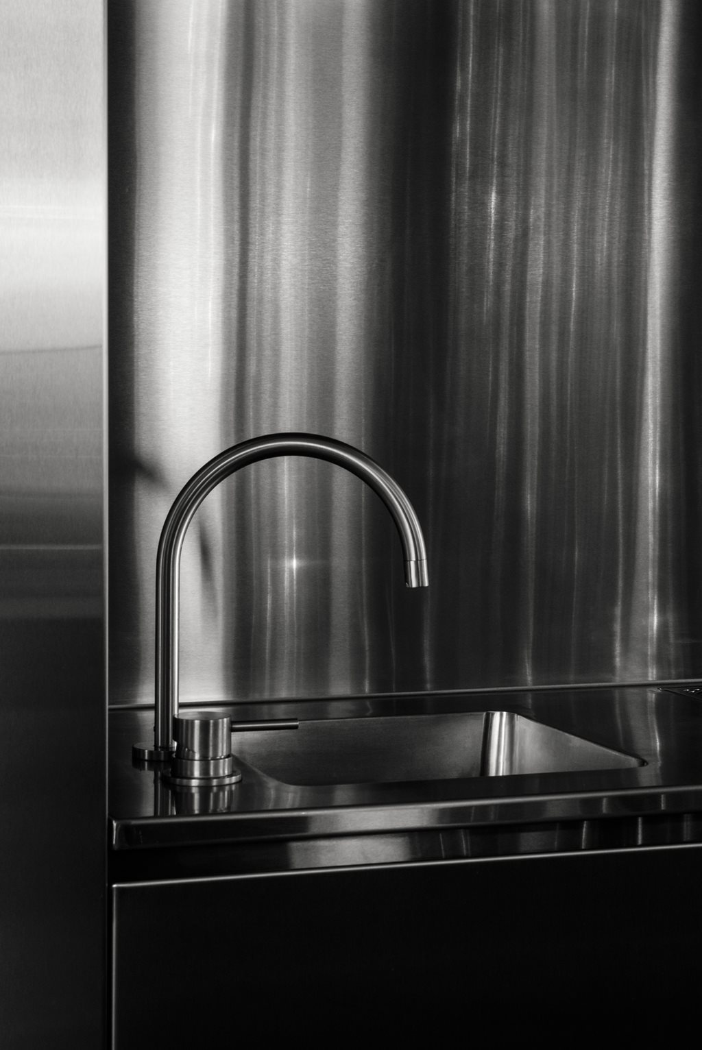
We also found the creation of the leather cushion detail to be a very involved process. A combination of prototyping and working closely with the upholsters to create an effortless fall over the stainless-steel rods which forms the iconic backrests to the banquettes.
Distilling the palate to a few materials is something that we are constantly having to consider throughout all phases of the process. As a result, innovation is always present in how we design and construct and is something that drives our creativity.
