From the architect:
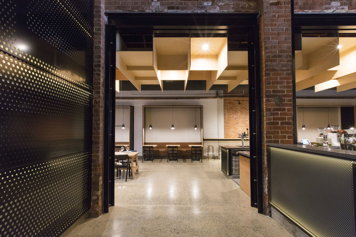
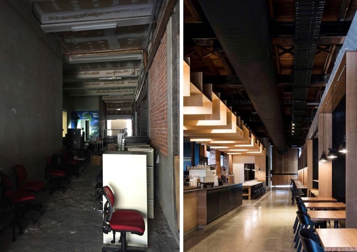
Headricks Lane is a refined restaurant and bar with an arresting interior, painstakingly distilled from a heritage-listed building that suffered decades of unsympathetic alterations and decline. A strong, singular architectural language, inspired by the revealed beauty of the raw structure, draws together the expansive footprint into a series of intimate cohesive spaces.
Located in Rockhampton (Central Queensland), the client’s ambition for Headricks Lane was unique, bold and complex – a space that would operate 18 hours a day, and span multiple and often contrasting customer moments: a refined evening restaurant and a bright and breezy brunch destination; an intense and edgy late-night bar as well as an engaging, localised microbrewery. The brief demanded careful zoning, and the creation of spaces that could seamlessly flex in both size and shade to subtly shift the ambience as desired – from dark and intimate to bright and spacious, accommodating hundreds of guests on a pulsating Saturday evening, but still maintaining vibrancy on a quieter weeknight or afternoon.
To achieve this, the architect developed a strong, singular architectural language – expressed as a series of horizontal and vertical surfaces in concrete, timber and steel that collectively deliver lighting installations, zone compressions, tables and seating. This language is used cohesively to stitch together the elements of the three core spaces that comprise Headricks Lane: the laneway (the foundation zone and heart of the restaurant); the brewery (open until midnight), and the longroom (a flexible space that can cater a large private function or open to seamlessly integrate with the brewery/bar).
CHALLENGES AND SOLUTIONS
Light / Materiality: the raw space had limited natural light and the existing heritage material, while quite beautiful, was dark. A bright airy feel was desired for daytime hospitality. This was achieved through a combination of sympathetic materials (e.g. blonde timber), grand, oversized timber pivot doors to front and back, white washing non-heritage brick and perforated, back-lit metal surfaces which had the effect of additional window-like lighting sources. These moves allowed the architect to draw out the beauty of both the new and old materials, while brightening the spaces.
Expansiveness / Compression: vertical and horizontal surfaces, particularly in timber, were used extensively to create separate spaces with distinct ambiences and intensity levels.
Modularisation: A mindset of modularisation was applied to the build, driving down cost and speeding up construction, while strengthening the aesthetic. For example, 800 x 2400 FSC rated timber boards were used for the ceiling, wall lining and furniture. Similarly, the perforated metal surfaces comprised entirely 1300 x 1100 sheets, with variation achieved through perforation sizing and lighting effects.

Before and after

