A closer look at Melbourne Place by Kennedy Nolan – a hotel magnetising Australian brands and reflecting a new design experience through a distinctly local focus.
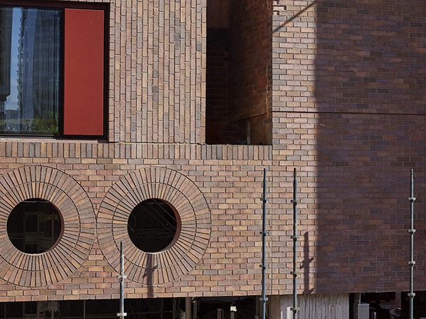
Design comes to the fore at Melbourne Place, as it is now known. Previously a lacklustre, meagre structure, today’s interpretation brings to mind an Art Deco site that has withstood the maelstrom of time and transience. Shepherded by the concrete jungle of Melbourne CBD, “Melbourne Place came from an original idea by Josh Taylor for an independent hotel in Melbourne – as he described it – the hotel that Melbourne needs,” says Patrick Kennedy, Founding Partner at Kennedy Nolan.
Modest in expression, the architectural features, curatorial finishes and furnishings fortify Australian brands and tell a story of commitment to countrywide designers. First impressions upon entry reveal a herculean digital screen housed behind the reception desk that automates through five digital collages, each respectively handpicked from the oeuvres of Australian artists. In this approach, a space that could be perceived as diminutive in size gives the illusion of far greater scale.
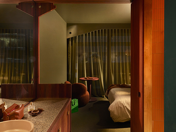
Ascending over 14 levels, Melbourne Place responds to myriad complexities. In a context where global chains dominate Melbourne’s hotel landscape, it meant that “the nascent hotel brand would combine the sophistication of Melbourne with its informality, its edge and its notorious cool. The very fabric of the building would be local and include elements designed and made by locals – furniture, lighting, tiles, taps and basins. Even the bricks were developed specifically for the hotel in Stawell in western Victoria with Kraus bricks.”
Kennedy continues: “Hotels rarely have the same architect for the building and the interior, but the totality of the concept can be so compelling and help embed a hotel in people’s collective memory, in the culture of a city. We looked at heroic precedents – the Parco dei Principe by Gio Ponti and the Royal SAS hotel by Arne Jacobson and, closer to home, Richards and Spence’s Calile in Brisbane. These are hotels where the total design experience becomes part of the story, intrinsic to the appeal of the hotel, and we wanted that for Melbourne Place.”
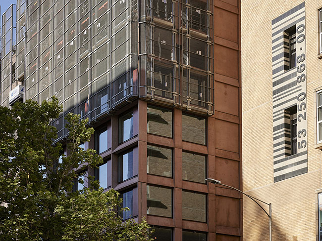
With an ever-evolving skyline, the metropolitan environment is framed in the everyday rooms, suites and penthouse options available, orientated and fenestrated towards the urban fabric – a consideration that positions the cityscape as an extension of the guest experience. “Hotels can be alienating, displacing, anonymous, even grim. We were keen to explore how to strike a balance between the excitement of a hotel stay, the theatre of the interior, could be balanced with a sense of domestic comfort. We aspired to elevation and excitement leavened by the nurturing qualities of retreat that you can achieve in a home,” adds Kennedy.
Level one plays host to an array of meeting and event spaces catering to weddings, corporate events, private dining and product launches. The Emerald event space is contemporary, light and erudite, with its form and colour palette reminiscent of the theatricality behind coveted Ricardo Bofill designs. Melbourne Place features a diamond in the rough among Melbourne event spaces — an open-air terrace overlooking Russell Street and the electric energy of the city. Meanwhile, more intimate affairs can be reserved for three additional spaces for hosting elevated board-style meetings and private dining. There is an assiduous culinary program including an aptly-named rooftop restaurant, Mid Air, sitting on level twelve of the hotel, while Marmelo rests on the ground floor and Mr Mills – its underground bar – evokes speakeasy sensibilities.
There is a pleasing link between the locale, which delineates the layout and configuration of rooms, and eclecticism, which informs the material palette. Harnessing a legion of materials, the selection criteria were characterised by wanting the palette to have a tangible quality.
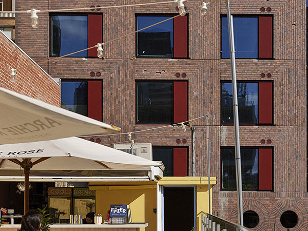
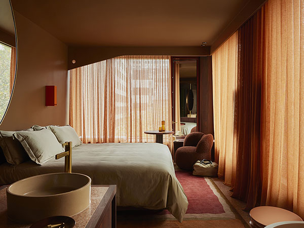
Kennedy Nolan “wanted to make everything from something you might want to touch – surfaces are textural, intensely coloured and made from real materials – the effect is the opposite to glossy, highly manufactured or artificial.” The extensive lacquer of Jarrah, oiled rather than coated, is juxtaposed with the intense colour deployed across the hotel. “We adapted this palette to do different things in different spaces, modulating the colour schemes in the guest rooms depending on the direction they faced in the city,” explains Kennedy. “Colours are layered and we relished the challenge of combining colour, texture and materiality as a combination of complementary but distinct elements, enlivened by unlikely flashes of hue which fluoresce or pop.”
The light permeation and intensity vacillate between each floor, further delineating the varied spaces. While programmed lighting in the public areas dims and intensifies through the day, climbing upwards towards the guest rooms, natural light infiltration is plentiful.

