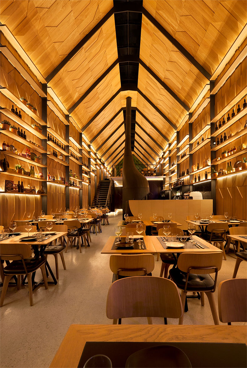
After more than two decades in business, a humble family pizzeria in the Victorian suburb of Mount Waverley has suddenly found itself transformed into a towering, cathedral-esque architectural icon. But despite its lien to religious architecture, the only thing worshipped here is served on a dough base.
Piccolino first opened its doors in the early nineties as a 20-seat pizzeria wedged among a suite of other suburban retail and hospitality offerings. Although it started small, the owner had ambition to grow. When this eventually became possible, it was architecture that was looked to as the means to solve problems of size, productivity and aesthetic.
It has been four years since Hachem Architects was commissioned to provide an extension of and improvement to the 20-seat venue. It was a long design process, but the end result was well worth the wait.
The resulting restaurant is not your average pizza restaurant; the exact outcome desired by the client. The design brief, though decades in the making, boiled down to one simple request: to create “something special”. Specifically, this was to be achieved by means of “a contemporary dine-in venue; a functions area; a slice of the city in the suburbs; a better environment for family, staff and clientele; and a brighter standard for the [Mount Waverley] neighbourhood”.

Cut to today, and the 20-seat restaurant now has capacity for 100 people. All this, without any major extension to the site borders. Indeed, one of the major constraints faced by Hachem Architects was size. The most significant cause of this was the fact that the existing restaurant was wedged between the foundation walls of what the architects describe as a “tired and unremarkable shopping strip”. This hurdle was further compounded by strict council constraints for the site.
Inside, the hero of the show is just what you’d expect of a pizzeria: the pizza oven. The curved, organic-shaped, matte-black structure consists of a pod-like oven at the base, which tapers off into a chimney that points upwards towards the space’s secondary hero: the ceiling.
Materially, the ceiling is an extension of the geometric panelled walls. The abstracted pentagon shapes of the wooden panels are used from the ground up, soaring above diners to form a pitched, pale timber roof that is cut down the centre with glazed-glass skylights. Steel frames dissect the interior envelope at horizontal intervals, providing both contrast to the wooden patina and additional structural support.

“[We used] a cohesion of few elements that maximise functionality. Its exterior is its interior; the architecture – steel frame, glazing and luminous timber – is it decor. There’s no excess – only light, warmth and room to move,” says Hachem. “Piccolino exceeds its limits, and enhances its environment.”

