This project is a redesign of iconic Brisbane pub, The Boundary Hotel.
As the pub was first established in 1864, KP Architects director Kon Panagopoulos wanted to ‘peel away the layers that had been applied over time’ to reveal the pub’s original fabric and structure. As per the brief, the architects were to strip it back while sensitively inserting new layers. The overall aim was to celebrate the rich history of the original building while reinvigorating its life as a ‘social incubator’.
“It was to have the feel of a traditional pub but with a modern approach to meet the demand and expectations of the local market,” says Panagopoulos.

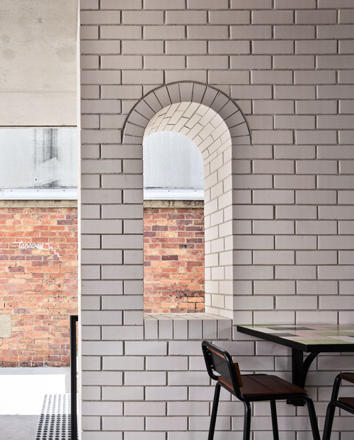
The architects used PGH Bricks’ Blanco Morada brick for all new walls on the first-floor addition. The bricks manage to complement the original brick and timber fabric of the building, while their crisp white colouring adds a contemporary feel. Contrasting colours were deliberately used for the old and new brickwork, with new interventions positioned away from the existing building to respect and accentuate its original form.
Panagopoulos and his team also used some of the existing brick work to create a playful design feature with a large hole and striking neon sign that reads ‘Just another brick in the wall’. Inspiration for this idea struck during a site visit early on in the project.
“There was an opening in the existing wall that gave way slightly, and several bricks were dislodged. They had then been randomly stacked in the hole by the builder and we liked the sculptural formation this created so decided to glue them down as an installation. We thought the neon sign would add an element of humour,” says Panagopoulos.

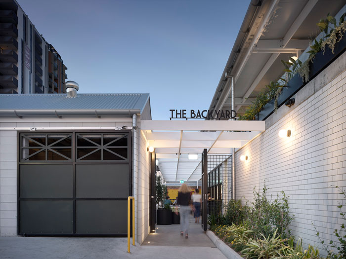
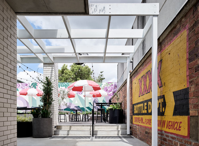
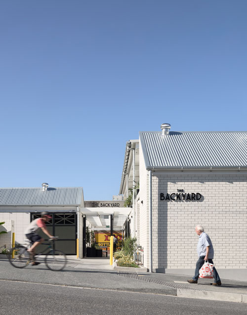
In addition to the clever use of materials, the pub’s reimagined layout also gives it a fresh lease of life. Pathways have been introduced to help connect the existing and new spaces over the three levels. For example, what used to be a drive through bottle shop is now a laneway that links Boundary Street through the ground floor to the upper levels. The original hotel rooms over the pub, which was mostly recently used for storage, have now been reinvented as function rooms whilst hidden storage areas on the ground floor have been opened up to increase the flow of space and light throughout.
Despite its large scale and multifunctional design, with areas for drinking, dining, entertainment and events, The Boundary now boasts a wonderful sense of fluidity and connectivity. The layout and materials help create a synergy between spaces whilst changes in palette subtly delineate and define their purpose.
A beer garden, for instance, has been introduced with a light and colourful palette that celebrates the outdoor lifestyle, which Kon says has been lost in Brisbane pub architecture over the decades. There is also a perimeter deck that overlooks the outdoor dining space with a large retractable roof to allow for versatility and sun protection, and a roof terrace with glimpses of the city.
Located on the eclectic Boundary Street, this is a pub that welcomes a diverse range of patrons and the new design caters well for this. With a fresh new look that simultaneously celebrates the building’s history but brings it into the 21st century, its design offers broad appeal.
“I think what was most special about this project was peeling back the layers to restore it to its original glory, for all the public to enjoy,” says Panagopoulos.
