From the architect:
Now that the Victorian lockdown is over, we decided it was time to celebrate the cafe scene in Melbourne once again, this time with Rustica, one of the most successful and recognised bakery-cafes in Melbourne.

Located within busy Melbourne Central Shopping Centre, Rustica’s latest location is surrounded by the frantic nature of modern life.
The main aim therefore, was to imbue the space with a sense of calm. To essentially make it an oasis in amongst the chaos and noise of the city. The most effective tools to achieve this was through the use of colour, light and clean design.
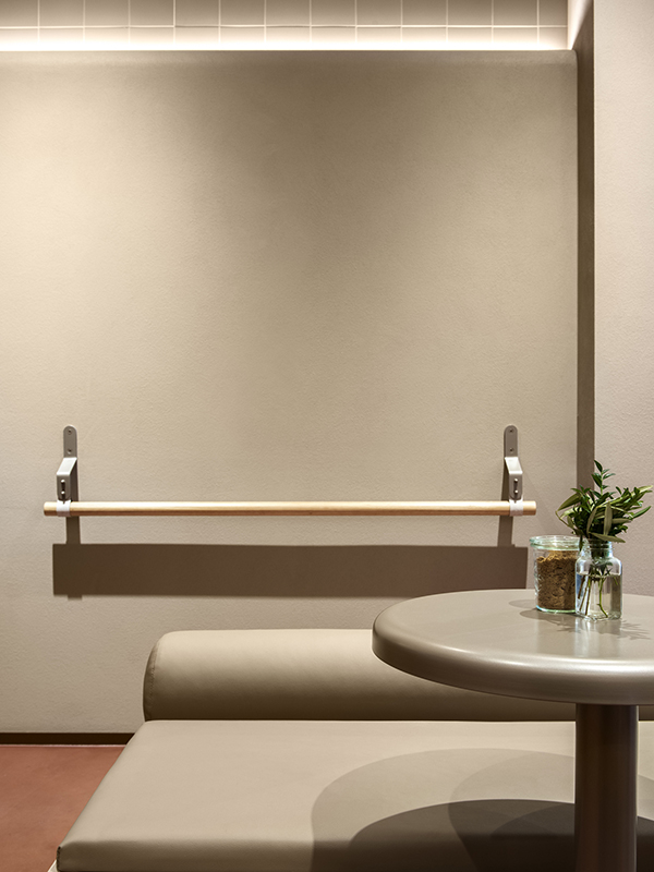
Within the bright, loud, clashing colours of a shopping centre we pared back our palette to an array of soft fleshy, tonal pinks. By minimising the scope of colour in this way, the space feels quiet and serene, especially in comparison to its frenetic surrounding.

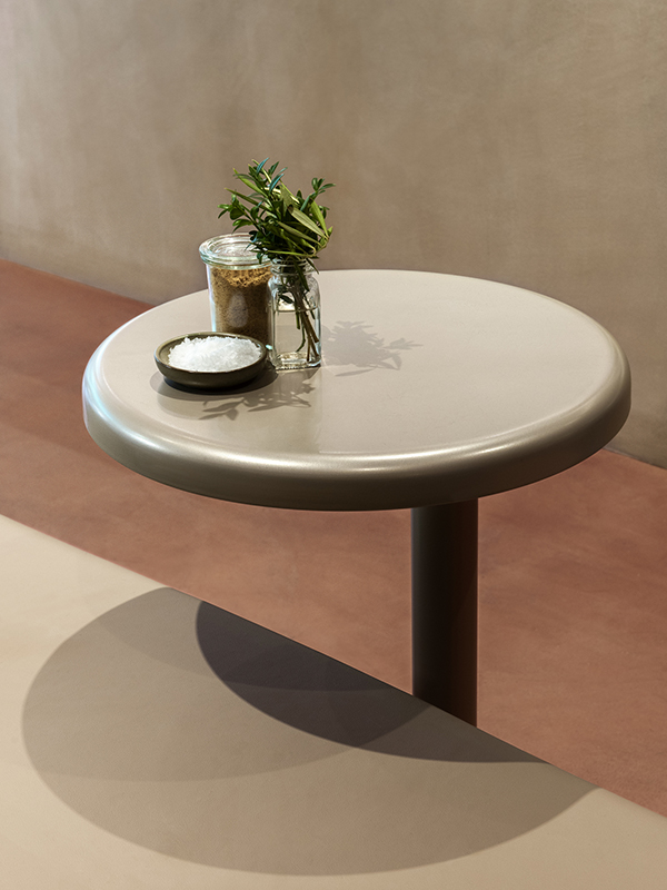
To heighten this nurturing feeling, all sharp edges, rounding off every joinery piece were eliminated. This curviness extends though out the space, including seating, tables, dado lines on walls and even feature lighting.
The use of materials augments this, as there are no hard, flat surfaces, instead we incorporated creamy renders and buttery leather-like vinyls.
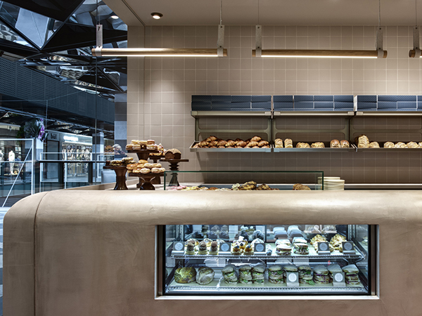
The use of lighting was another key to creating a sanctuary within the shopping centre. The main lighting within the space is from the use of wall lights, that throw soft pools of illumination, rather than the harsh, overhead lighting of its surrounding spaces.

A stand out feature, is the rounded, monolithic front counter that travels throughout the space and literally pushes through the front window, extending a welcome to those that pass by.
This is the epicentre of deliciousness and needed to calmly command the interior.
This all creates an incredible backdrop for the café’s true heroes; the bread, cakes and coffee.

