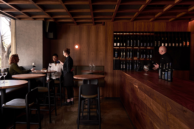
At the very heart of Melbourne, Denton Corker Marshall has envisioned a space reminiscent of a wine cellar or barrel for a new and exciting French restaurant: Vinesmith City Cellar Door.
Utilising rare Australian woods to create a warm, inviting atmosphere, the practice has come up with this concept of a timber cave, which quickly became the cornerstone of the practice’s design philosophy, guiding the architects through every stage of the project, from initial concept to the final details.
Kei Kitayama, Senior Associate at Denton Corker Marshall, sat down with Architecture & Design to talk about the genesis of this unique project.

Architecture & Design: Can you describe the initial vision for this project and how it evolved over time?
Kei Kitayama: The initial vision for this project was influenced by the unique characteristics of the site, which is divided into two distinct zones separated by steps.
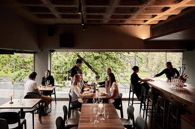
The front zone, facing Spring Street, features full-height glazing that offers expansive views and abundant natural light. In contrast, the rear zone has limited access to daylight, presenting a unique challenge and opportunity for creative design.
Inspired by these site conditions, we envisioned a space reminiscent of a wine cellar or barrel, utilising timber to create a warm, inviting atmosphere.
This concept of a ‘timber cave’ became the cornerstone of our design philosophy, guiding us through every stage of the project, from initial concept to the final details.
The use of timber not only addressed the spatial challenges but also harmonised with the venue’s main purpose of showcasing iconic cool-climate wines from the client’s vineyards in Victoria’s Pyrenees and Grampians appellations.
The timber elements evoke the craftsmanship and natural beauty of the wines, creating a cohesive experience for visitors.
This vision evolved as we refined the design, ensuring that every aspect of the space reflected the initial concept while adapting to practical considerations and enhancing the overall aesthetic.

What were the biggest challenges you faced during the design and construction phases, and how did you overcome them?
One of the most significant challenges we encountered during the design and construction phases was the height restriction imposed on the site. The client’s brief included a requirement to expand the floor space on the first floor, which necessitated innovative solutions in both structural and building services design, encompassing mechanical, electrical, and hydraulic systems.
To address the height limitation and mitigate the risk of patrons feeling claustrophobic, we devised a creative approach by incorporating a waffled timber structure.
This design not only allowed us to achieve higher ceilings where possible but also added a sense of openness and airiness to the space. The timber waffle structure was intentionally designed to echo the existing concrete waffle structure on the upper floor, creating a cohesive and harmonious aesthetic throughout the building.
This solution not only met the client’s brief but also enhanced the overall spatial experience, ensuring that the expanded floor space felt both welcoming and spacious.

How did you ensure that the project met the client’s needs and expectations?
To ensure that the project met the client’s needs and expectations, we prioritised maintaining consistent and open communication throughout the entire process.
Given that our client frequently travelled overseas for business, we adapted our communication strategies to accommodate his schedule and time zones.
The client’s brief incorporated ideas inspired by his travels, especially in France, where his family has a small chateau. So we held detailed discussions to evaluate the feasibility and alignment of these ideas with our overall design concept. This collaborative approach allowed us to integrate innovative elements while staying true to the project’s vision.

Were there any unique or innovative techniques or materials used in this project?
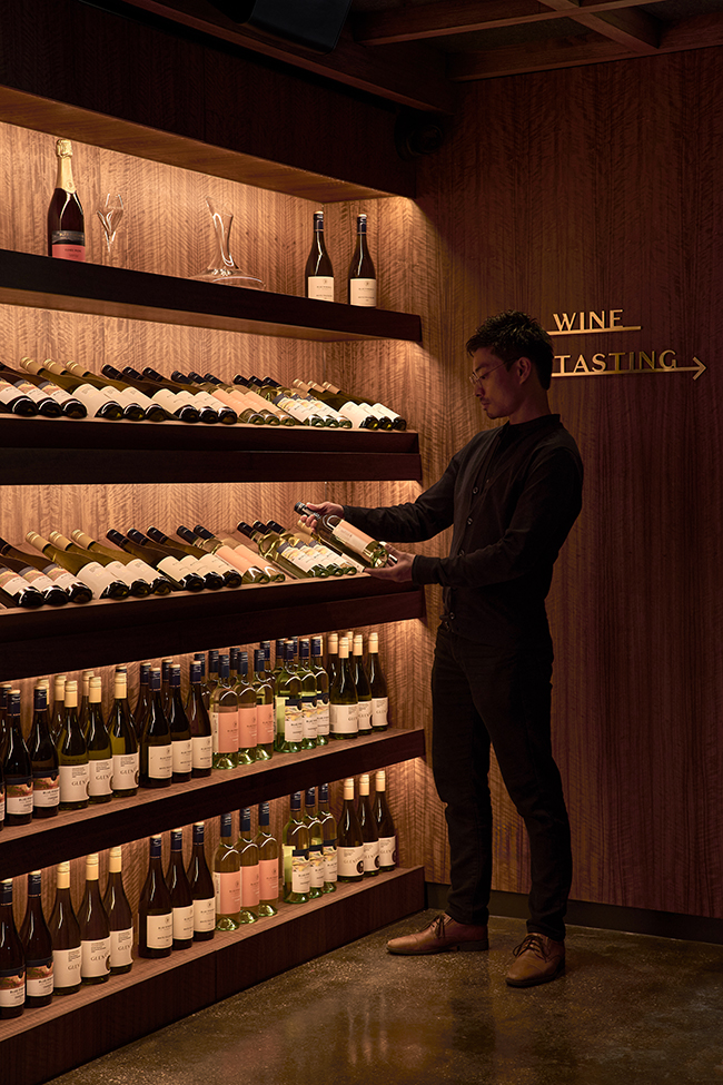
In our quest to create a distinctive ‘timber cave’ atmosphere, we chose Queensland Black Bean as the primary feature material. Popular in the 1930’s and then in the 1980’s, Black Bean offered a unique blend of nostalgia and modern design.
Despite initial concerns about its potentially outdated appearance, its rich, dark hues and intricate grain patterns transformed the space, adding depth and organic character.
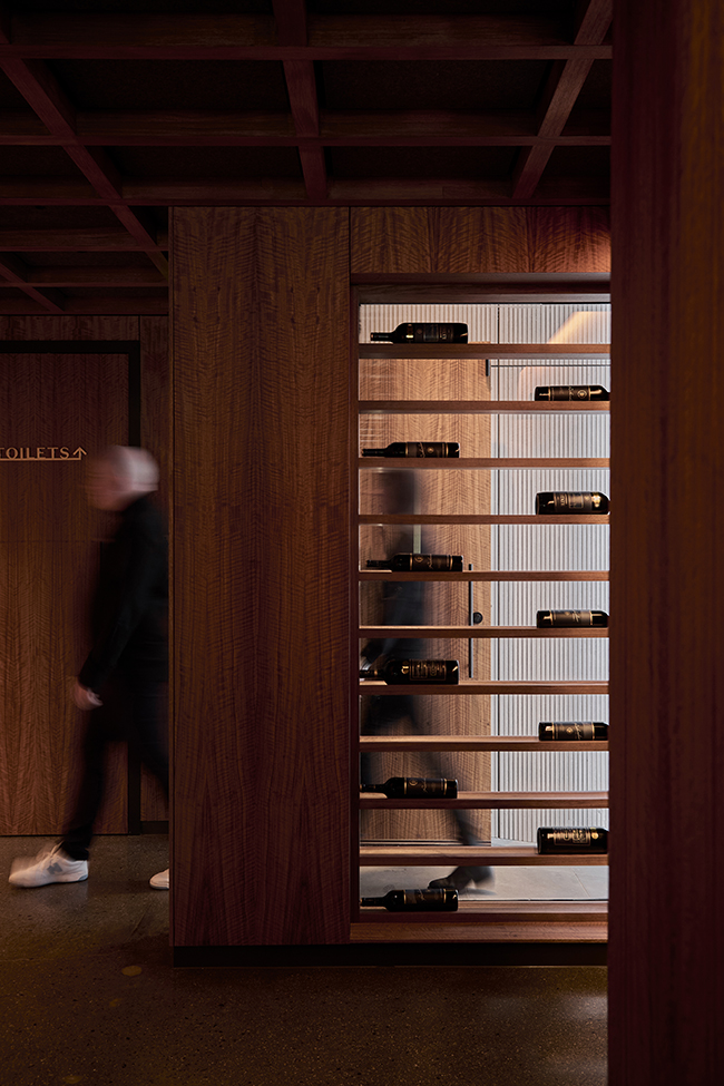
To enhance the visual impact of the space, we collaborated with specialist lighting consultants Electrolight on a thoughtful lighting design. Carefully selected fixtures and strategic placement highlighted the timber’s texture and colour variations, creating a warm and inviting ambiance.
By reintroducing Black Bean in a contemporary context and integrating well-considered lighting, we crafted a space that is both unique and timeless, celebrating the beauty of Australian timber in a modern setting.

How does this project fit into your broader portfolio and design philosophy?
At Denton Corker Marshall, our design philosophy is anchored in the creation of quality architecture that is meticulously crafted and conceptually robust.
The Vinesmith Urban Cellar Door stands as an example of this philosophy, embodying a harmonious blend of simplicity and sophistication. This project seamlessly integrates into our broader portfolio, which is characterised by a consistent emphasis on clarity of form, thoughtful materiality, and a commitment to creating memorable spaces.
The Vinesmith City Cellar Door is more than just a functional space; it is an experience. By focusing on simple geometric forms, we have ensured that the products on display are the true heroes of the space, enhancing the visual appeal and enriching the overall experience for patrons.
This approach not only aligns with our design principles but also elevates the project, making it a unique and memorable destination.

