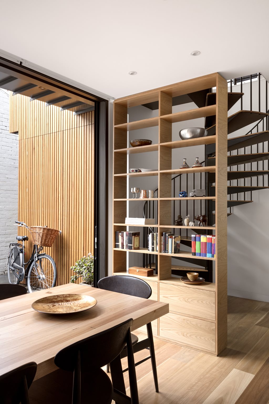
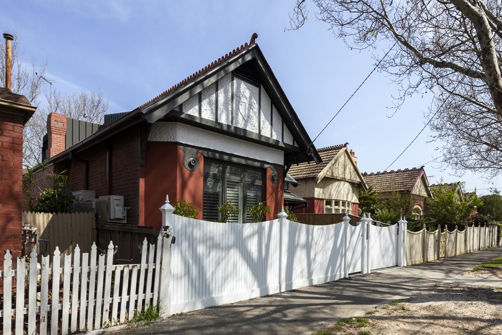
Just as you can’t judge a book by its cover, you can’t anticipate an architectural project from its façade. From the street frontage, Jigsaw House is a single-fronted, single-storey, painted brick stucco Edwardian that finds its home in the suburban Melbourne context of St Kilda West. After a much-needed restoration by Melbourne-based architects mcmahon and nerlich, it became a single-fronted, painted brick stucco Edwardian that was interlocked with a raised and modern secret, tucked behind its heritage-protected face.
Due to the heritage overlay and strict local planning regulations, mcmahon and nerlich needed to extend the current floorspace of the existing home in order to achieve the extra rooms contained in the brief, but they needed to do so within the constraints of the Port Phillip heritage policy and building setback diagram. This entailed remaining recessive from both the street and the property’s neighbours.
Space was tight, meaning that – as the name would suggest – finding it presented an architectural puzzle. The solution was a careful calibration of space; a balance of finding rooms that were neither big nor too small, then putting them in considered conversation with one another. Where rooms were larger, the architects took surplus space from adjacent spaces. They were also aware of the possibility presented by adding an upper level, as it meant light could be filtered through from the top to the bottom of the house, thereby enhancing the existing floorplan.
Although the metal-clad addition is quite obviously an addition when viewed against the heritage patina stucco, mcmahon and nerlich’s design nods to both the form and materiality of the older building. The gable roof is referenced in the diagonal slope of the dark steel – which is cantilevered over the northern courtyard – and red brick was added to the rear boundary to fit the two pieces of Jigsaw House together.
From the architect:
Describe the 'puzzle-like' solutions.
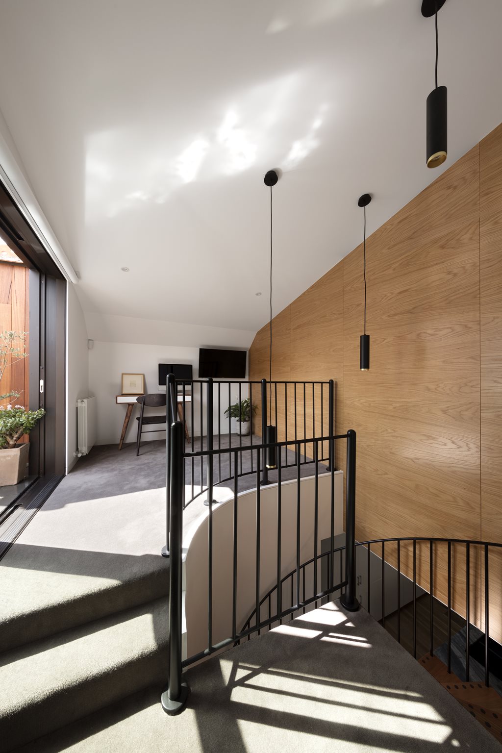
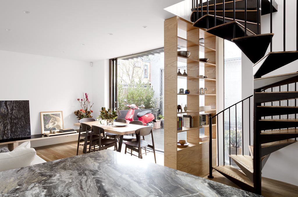
Jigsaw House celebrates the constraints of the tight site and family home, and to achieve the desired accommodation and light, essentially all rooms interlink in some way. The spiral stair deflects the wall to the adjacent bedroom, the family bathroom pushes into the front bedroom. To reduce the overall height, the ground floor was lowered to natural ground level to the rear part of the site. At the top of the stair, a study and terrace cut into the bedroom below and crouch in under the existing roof. The main bedroom has raked walls and ceiling to maximise the usable floor area and cantilevers over the courtyard to provide a generosity that belies the tautly scaled form.
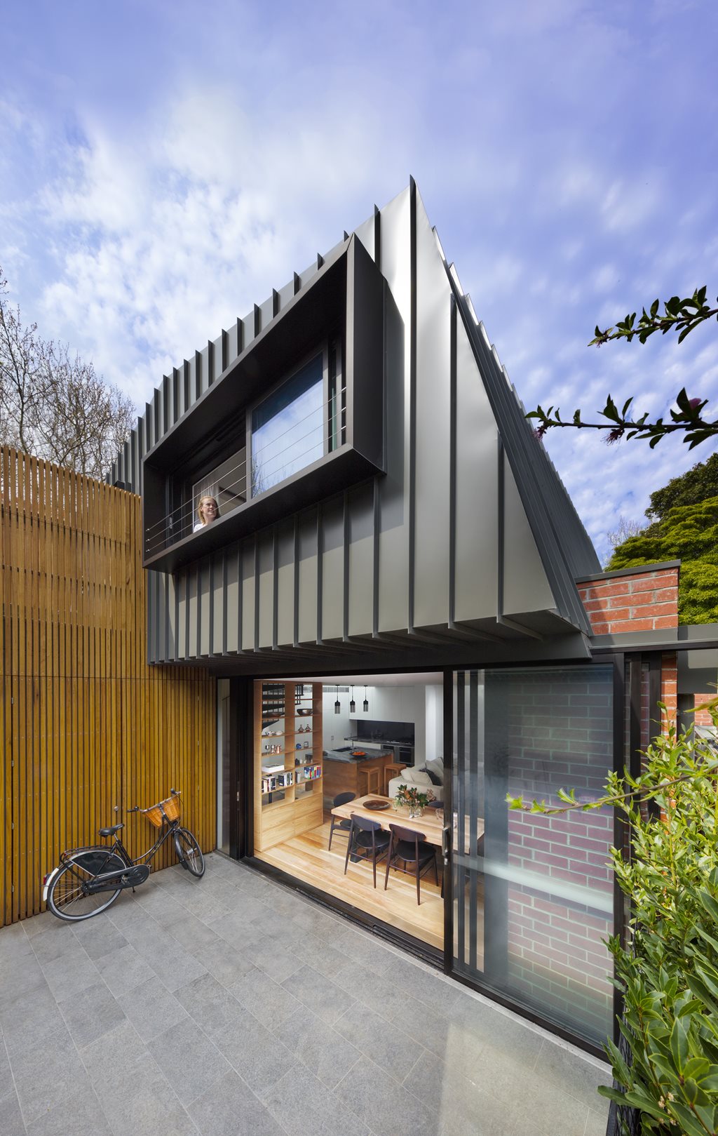
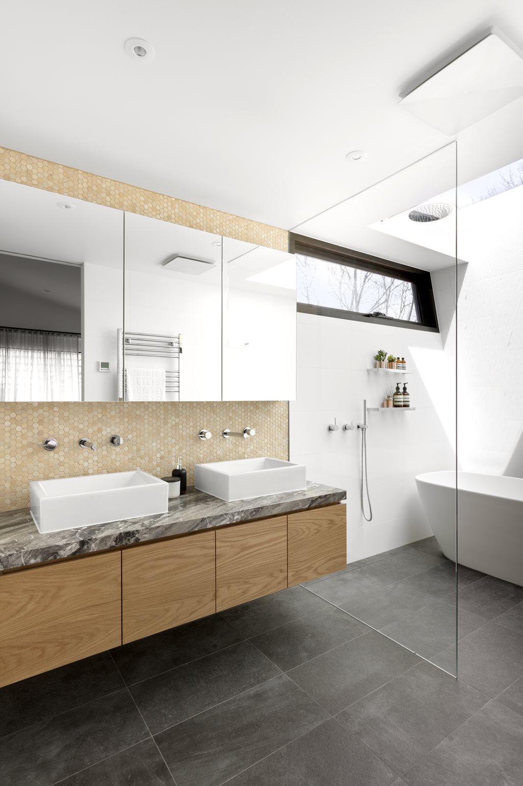
Beyond the bedroom, the delightful ensuite window gives views into trees beyond (and natural ventilation) and a large, clear glazed skylight adds a sense of luxury to the bathing experience. One literally bathes under the stars.
The toilet is tucked in under the existing roofline to allow a more generous room (and twin hand basins). Another door from the bedroom leads into the walk-in robe. The robe straddles the existing and new areas with constrained head height (it is partly under the existing roof) while a surprise louvre window allows views out [of] the kitchen skylight to the roofscape beyond.
What are the sustainability features?
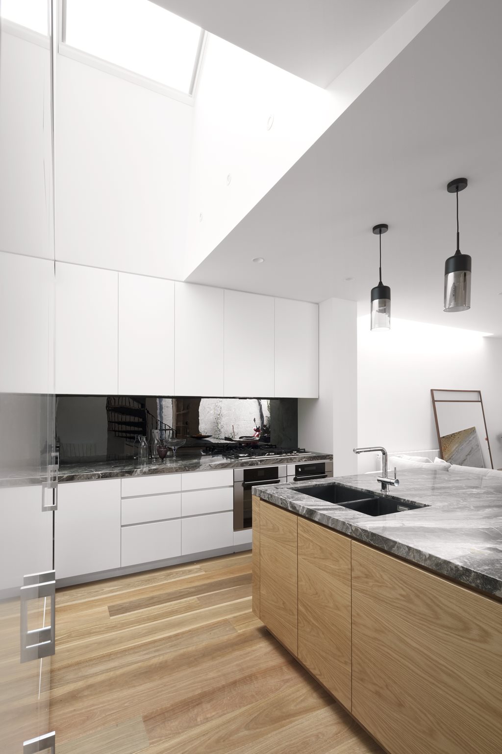
Sustainability was integral to the design. Every opportunity was made to bring in natural light, be it through raking skylights, borrowed-amenity skylights or the three north-facing sliding windows. All windows and doors have been double-glazed and insulation [was] added to existing floor, roof and walls to provide a 21st-century envelope.
Carpets and other materials have natural dyes and recyclable components for lifecycle carbon reduction. Paints and floor finishes are specified to be low-VOC so that the clients can move in straightaway without headaches or chemical smells. A water tank has been installed under the ground and paving areas drain to rain gardens to ameliorate stormwater impact.
