From the architect
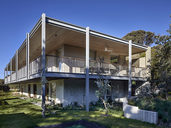
“Our clients came to us with a book of mid-century classics, in which, much to our delight, they had earmarked a photograph of the deep verandah of the Farnworth House by Mies Van de Rohe, which along with the qualities of the location and site, gave us our starting point.”

The modernity of Mies, Neutra, Seidler and Utzon was referenced, to place the project and its similarly ‘wordly owners’.

“A Seidleresque ramp leads to a luxurious self-contained upper floor for easier future access, whilst the lower ground floor houses the new laundry and quarters specifically for guests.”

“Underfloor space was reclaimed to create a man cave and occasional storage for a special car.”

The arrangement of the family, kitchen and dining space is designed to be social, true to the modernist ethos. With an open plan living room, walls of custom joinery, fireplace, high overead windows, and floor to ceiling glass sliders, all these features pay their respect to the appropriate techniques of modernity, according to Hindley & Co.

“Almost architectural natural linen sheer curtains and Japanese style sliding screens give control over privacy, light and views. Joinery is multi-functional and spaces areflexible in function and level of privacy.”

“Mies van der Rohe’s Farnsworth House and Barcelona Pavilion provided ample inspiration for our clients in the early design phase, and we have referenced key details from this Modernist classic in the project’s deep, cantilevered verandah.”

“The double storey form achieves the illusion of a single-storey home when viewed from the street. This is just one of the many ‘less-is-more’ features we were keen to highlight when choosing mid-century influences for this home.”

