"It takes a village to raise a family.”
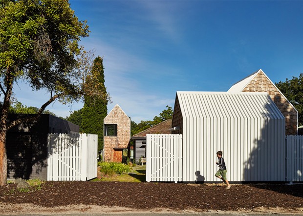
If Tower House had a motto, this phrase would be it. After all, instead of the traditional monolithic block addition to the back of an existing home, this Alphington, Victoria renovation and extension features a row of small structures with a scale and texture that do not dominate their context, so that a hamlet of sorts is created.
This design choice, while put in place by Andrew Maynard Architects (AMA), is the result of endless conversations between the architects and clients, who had keen interests in the environment, outdoor recreation and the arts.
“We first met to discuss Tower House just days before a federal election…[and] our discussion on that first day was not about kitchens and bathrooms,” reflects Andrew Maynard. “Our discussions were about life, art, politics, charity, the universe and everything.”
But while the carefully considered ideals of the clients – nurturing, stimulating, delightful, legacy, character, discourse – were inspired, putting these ‘abstract’ concepts together so they take shape as spaces and a building was at first challenging. In fact, Maynard admits that one early design meeting in particular left both architects and clients confused, lost and tired, as the complexity and possibility of a blank page led them deep down the rabbit hole.
They didn’t stay in Wonderland for long though, as the clients’ eight year old twin sons, who had been tasked to entertain themselves with paper and pencils during the meeting, presented the architect with simple sketches of their dream home, complete with notations.


“Their sketches distilled a lot of ideas. They had firmly pushed the boat off the shore and we were on our way,” says Maynard.


From this jumping off point, AMA designed an anti-monolith home that is both a village externally (a series of structures) and a home internally (large and connected spaces and functions). Instead of copying the original structure’s red brick and dark-painted weatherboard profile, the team chose to add wooden shingles to the gable ends of the new blocks that responded to, rather than imposed on, the site’s leafy post-war suburb street and country road-like backyards.
The new form runs along the southern boundary so that it is soaked in sunlight, complemented by openings and windows designed to optimise passive solar gain.
 The roof is another key design tenet for Tower House. Drawing from Jorn Utzon’s fifth façade idea, which acknowledges the roof as the part of the Sydney Opera House that would dominate views from the Harbour Bridge and nearby towers, the architects decided that the street front would no longer be the public face of their buildings. Instead, this crown was passed on to the roof, which is made accessible to anyone, at any time, thanks to Google Earth.
“We can now easily see all of the mess that has been hidden on the rooftop. What was once hidden is now fully displayed. With this in mind we deliberately designed Tower House so that it looked beautiful from the sky and from Google Earth,” the design team explains.

White roofs reduce urban heat sink and heat transfer internally, while making a statement about who Tower House is.

This open attitude is also found in Tower House’s front yard, which has been made into a communal vegetable patch that welcomes neighbours to help themselves to the crops, or do a little gardening if they so wish. The rest of the garden is surrounded by a high fence that provides protection and privacy alongside visibility. When these gates are left wide open, the line between public and private begins to blur.

Traditional ideas of what a home looks like and means is furthermore challenged with Tower House’s interiors.

Only one of the new gabled additions is two-storeyed and visible from the street. Designed as the twins’ studio, this building is a wholly vertical space with a bookshelf running from floor to ceiling. Separating the uppermost points to the base of the studio, dominated by desks, is a hanging net where the boys can read, hang out, and contemplate with views to the street and the backyard.


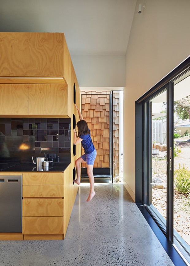
 Mum’s library is yet another pleasant surprise. Slightly submerged and looking towards a planted courtyard, her work desk is almost buried in the garden and lined with dark spotted gum. Dad’s ‘sneaky hideaway spot’ is again, different – a roof space above the kitchen, lined in synthetic grass and containing nothing more than a banana lounge and books.
Designed to be a long-term family home, Tower House can be easily adapted from being a shared unit to becoming two separate zones with distinct entries via hidden sliding panels in the original house, which allow the large shared rooms to be divided into smaller areas.
“A variety of different activities can take place, whether shared or private. It’s the best of both worlds,” concludes Maynard of the village pretending to be a home, and a home pretending to be a village.


Andrew Maynard Architects
Directors: Mark Austin and Andrew Maynard
Design Architect: Andrew Maynard
Project Architect: Mark Austin
Builder: Overend Constructions
Engineer: Maurice Farrugia and Associates
Garden and Landscape
Garden design: Bush Projects and Andrew Maynard Architects
Plant selection: Bush Projects
Landscape contractor: Lucida Landscapes
Photography by Peter Bennetts. Source: Dezeen, Andrew Maynard Architects

