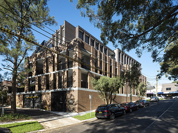
Situated in Willoughby, The Bowery is a mixed-use infill project four storeys in height of 17 dwellings, two commercial spaces, two-basement levels located in a heritage conservation area.
The site is a gateway site to a retail/ commercial strip that is struggling, like many other similar locations in Sydney, to adapt to contemporary retail demands with poor quality living opportunities and a very busy road to contend with.
The project addresses how to potentially re-address these issues and create a desirable place to live (17 apartments) over four storeys with great commercial spaces located along one of Sydney’s busiest streets thus providing a vision for future projects in the area to follow.
A vision relying on a deep understanding of context, history and stitching together rather than scale and “bling” to create the next evolution for Willoughby Road in Sydney’s inner-north.

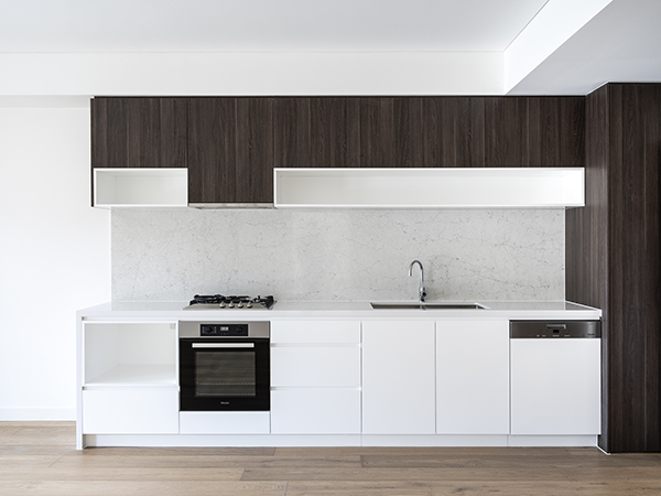
AJH+ was commissioned to undertake architectural and interior design through all phases.
Addressing traffic, privacy, solar access and the heritage qualities of the precinct relied on contemporary reinterpretations of historical architectural ideas.
In the late 1800’s, Willoughby was a brick-making hub with a variety of manufacturers being located in the area. The existing rich tapestry of crafted brick buildings, many of them heritage listed today, pay homage to this era.
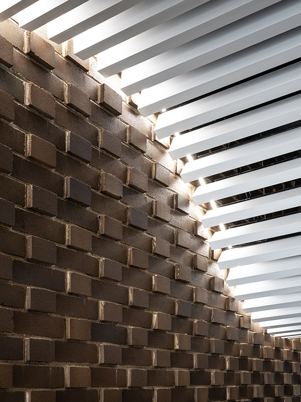
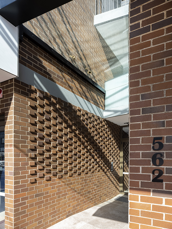
The Bowery continues the rich history of considered, well-crafted brick buildings in Willoughby by wrapping the Bowery in Bowral Gertrudis brown “base” and Bowral Blue “top” articulate and define the architecture.
The Bowery uses brick loggias, an external space to the side of a space (usually residential) with columns defining its perimeter, on the lower levels and a fine colonnade on the upper levels to resolve a number of competing requirements. The material selection was also such that it minimised any maintenance concerns and as well as easily aligning with the history of place.

The reinterpretation of the loggia on the lower levels are taken to the boundary line, providing expanding and contracting openings, providing privacy from the busy street.
The vertical loggia blades for the balconies also creating a strong sense of an “outdoor room” as an extension of space for the apartments connecting the inside with the outside.
Their articulations respond to the street being wider and more solid providing protection, an initial buffer from sounds, visual privacy and continuing the masonry base characteristic of the precinct.

The simple brick gesture engages The Bowery with the existing brick context. The gesture is treated in an unpretentious manner relying on its materials, proportions responding to uses and is invigorated by the subtle changes that create a variety of very useful “layers” for commercial spaces and residents.
Balconies, outdoor rooms, commercial facades, lobbies, communal open spaces, the steepness of the site, separation of neighbouring uses and addresses to the street all interact with the loggia, vary it and adapt the simple gesture.
The varying apartments planned around access to their own “outdoor room” with all living and bedroom spaces located to benefit from the space providing flexibility for expansion, ventilation, external amenity for residents and adjusting with needs as time passes. This provides a well- received unique offering to the market
On the upper levels where there is less privacy and sound concerns a Bowral blue brick colonnade of finer proportions is introduced facilitating distant views, providing solar protection and articulating a tapering of the plan to address the corner gateway site.

Commercial and residential spaces have vastly different requirements. These requirements (functional/ security/ privacy etc) are often conflicting and opposed.
Whilst above the retail/ commercial the residential spaces follow the footprint of the retail/ commercial on ground to locate living spaces against the noisy street with no buffer or environmental benefits. The combination of these factors makes both unsuccessful
The commercial spaces, larger than existing examples, are brought forward to the street line and turn the corner. This provides opportunity for “filtration” through many street entries, maximising openings to engage with the street addressing the human scale and providing a balcony for the commercial space.
The apartments are setback as far as possible from the street using distance as the buffer from street. The main spaces (living/ bedrooms) face this buffer providing a protected external outlook to the apartments.

