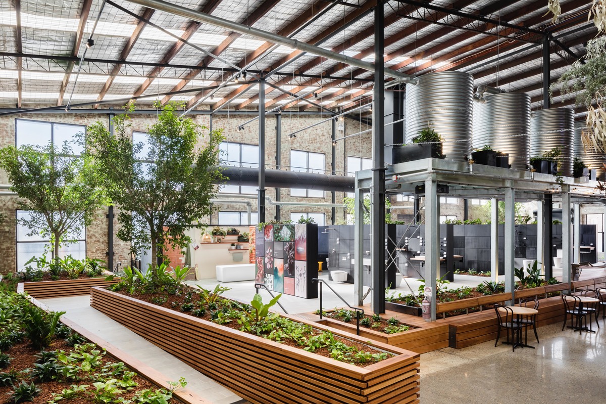
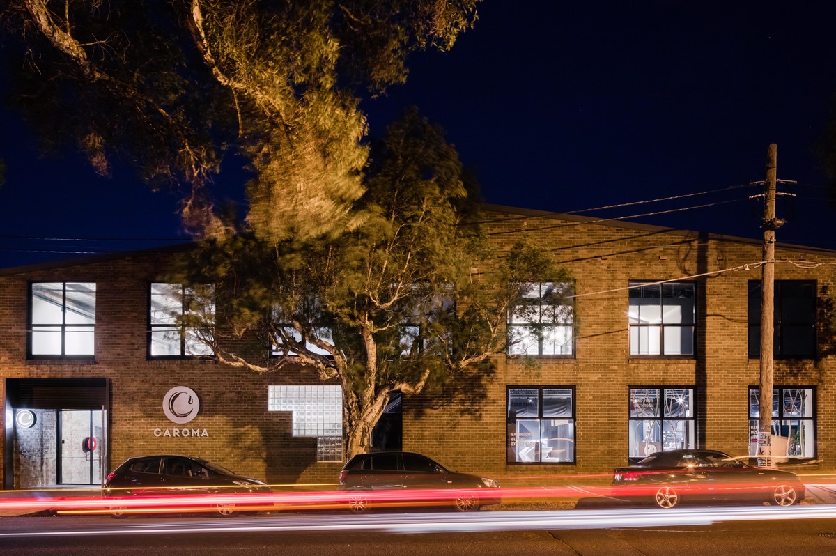
Caroma on Collins, which hosts Caroma’s Sydney showroom, is an attempt to communicate the company’s values through volume, symbol and material. Instead of pushing products onto customers in a traditional showroom manner, Caroma on Collins provides a space in which people can breathe, sit, slow down, explore and experience.

From the architect:
BRIEF AND DESIGN RESPONSE
The brief was simple: make physical the values and history of Caroma. Contained within that simple brief was a much deeper conversation around Australian culture, innovation, and sustainability. All too often brands wish to turn away from their past and become “aspirational”, although this is not Caroma.
Caroma is the plastic taps at your Nana’s house that are still kind of hip, the cistern that is still working after 30 years, and the bath you sit in with your first child. This type of history deserves an honest narrative that is rich with texture and symbolism.

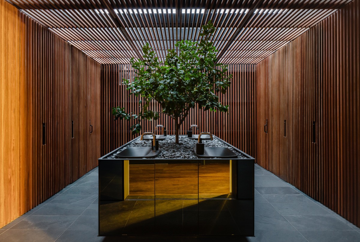
We wished to communicate Caroma’s values through symbol and material rather than a superficial marketing strategy. For instance, the galvanised water tanks are a nod to the Australian pioneer, the recluse farmer who valued water above all else and who had to innovate and adapt to survive. Then there is the lemon tree that sits in the bathroom, speaking of a time when one was conveniently planted near the back door acting as a make-shift second bathroom.
Material selection was also important, with the use of mild steel and spotted gum, materials which age gracefully, developing character over time. Lastly, it was important that the space felt open and welcoming without feeling vacuous or intimidating. We were conscious of the “paradox of choice” where too many options create choice anxiety, so products are clearly displayed in limited numbers. A child’s water play area by the Agency of Sculpture and level access to all areas and displays ensures equal access and activity for all users. The outcome is a new community space located in the heart of Sydney’s showroom district.
CHALLENGES

The first major design challenge was to create a space that reflected on Caroma’s past while invigorating the present and setting a firm direction for the future. The second major design challenge lay in finding the best approach for articulating this narrative into a spatial experience that the body would instinctively recognise. Our intuition told us that the space required a slow, casual and approachable pace where experience and exploration trumped the sale, turning the typical showroom experience into a stroll through the bush.
SUSTAINABILITY
Caroma’s focus on making it intuitive for customers to use less water was embodied in the showroom design's reference to natural hydrological cycles. The project includes 40,000L of rainwater storage, collected in tanks and reused for irrigation.
The design of the interior landscape supports a number of sustainable aspects. The evapotranspiration of the plants provides natural cooling, filters pollutants from the air and creates a connection to nature that supports the well-being of both staff and visitors. This landscape was specified through detailed daylight and temperature analysis.
The need for active heating and cooling is minimised through the creation of an 'indoor/outdoor' atmosphere for most spaces. Supported by the landscape, the majority of areas act as semi-conditioned spaces, maintaining the comfort of occupants within a broader thermal comfort band. This allowed a highly efficient indirect evaporative cooling system to be specified, dramatically reducing operational energy use. Smaller, fully conditioned spaces are contained within the office and conference room, offering a higher level of thermal control if required.

