Warehouse design is, to put it bluntly, typically one of the more boring typologies out there. As boxy, static structures with little internal division, they are also notoriously hard to make sustainable.
For a company specialising in whole body health, this latter made the design of their new headquarters in outer-eastern Melbourne particularly ironic. Ironic, but also problematic.
When Melrose Health approached BENT Architecture after moving out of their former headquarters in Mitcham, they didn’t want a “warehouse conversion”. They wanted an overhaul – inside, out, and in the murky middle of these bookends. The result was the transformation of what the architects called “a fundamentally static and soulless office [slash] warehouse building” into an environmentally responsive and engaging workplace that accommodates warehouse, administration and landscape functions – the full, healthy repertoire of the holistic health-based company.
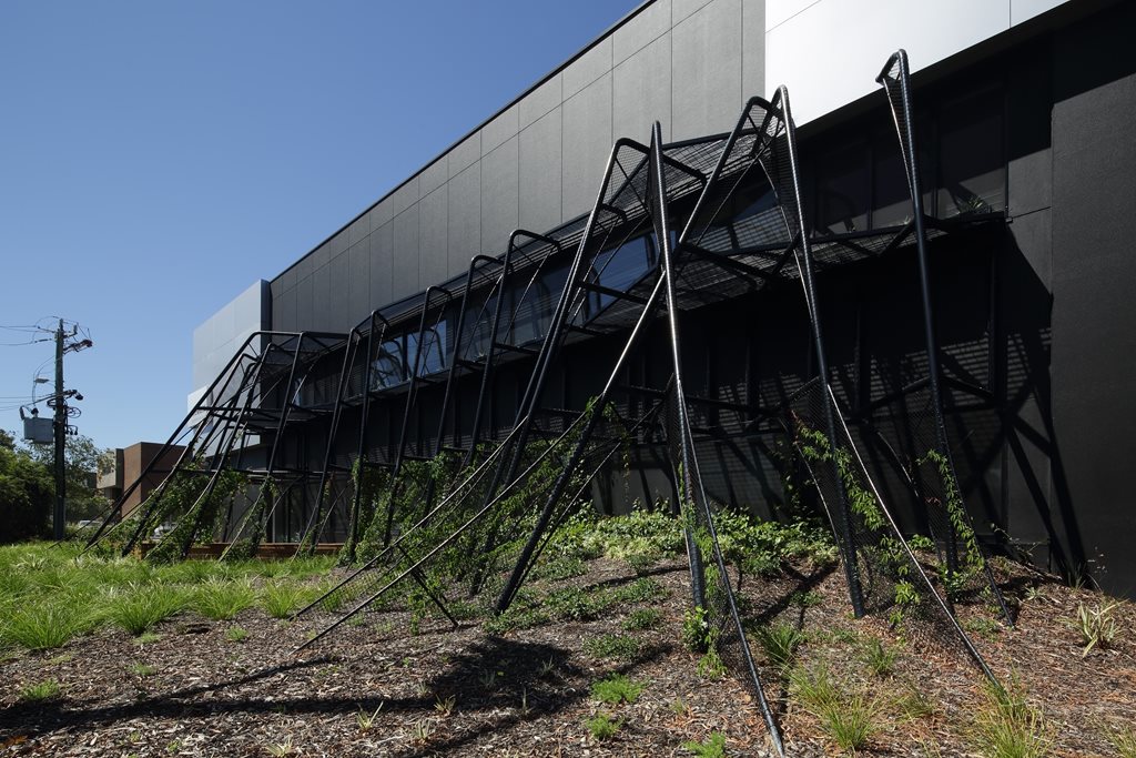
First on the chopping block was the façade. The two-storey street frontage was “eroded” by an organic, tubular steel structure that was inserted as a connection between landscape and building fabric.
“Part sun-shade and part landscape arbour, the [steel] structure liberates existing north-facing windows that would otherwise cower from hot summer sun, and provides a conduit for greenery to permeate the office interior, enlivening the workplace whilst defining diverse spatial zones, including co-working areas, quiet spaces and collaborative, ‘landscaped’ breakout zones,” the architects comprehensively explain.
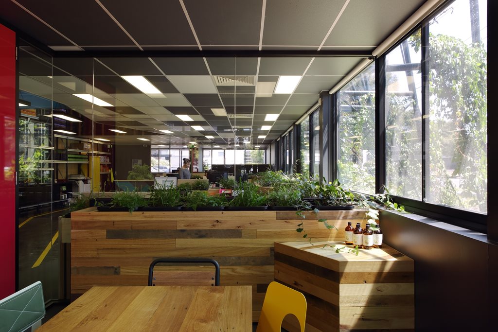
“The division between office and warehouse was also eroded, creating a more immediate connection between the various operations of the company. The result is a project that embraces the Melrose ideology of whole body health by creating a workplace that is responsive to the natural environment and engaged with the processes within.”
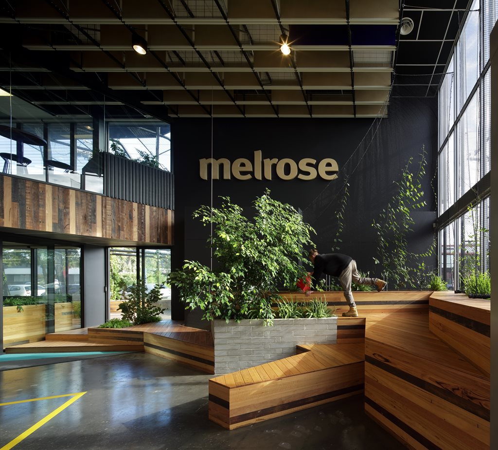
Not only is the project responsive to the exterior natural environment through both the tubular structure and openable windows, but it incorporates landscaping within the warehouse. Modular garden beds and supporting planters use recycled materials and showcase Melrose products, while a light-filled, double-height foyer incorporates timber-lined terraces, a weeping fig, vines and natural sunlight. Plants were selected with the input of a horticulturist, who helped choose plants that would suit both internal and external conditions, and which would survive in-situ without the need for chemical fertilisers.
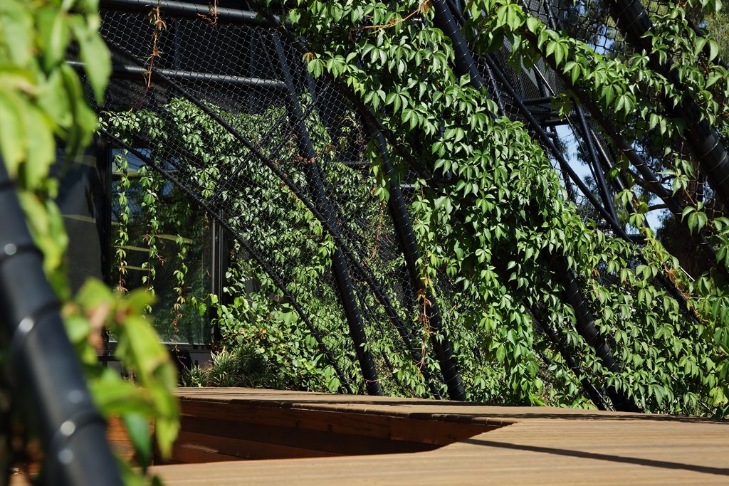
Joinery modules, terrace seating and wall linings have predominantly been created from recycled messmate and EO-rated timber boards. The pin boards used within work stations have further been lined with the off-cuts of carpet tiles.
In a final coup for sustainability, electrical and mechanical services were reconfigured to suit the new layout, with power and data outlets either being retained or relocated. Internal solid partitions were either removed or replaced with glazed alternatives, further facilitating the penetration of natural light, and existing infrastructure – such as stairwells and associated handrails – were kept in their original locations.
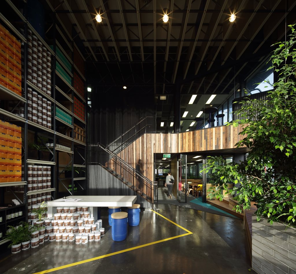
“By eroding the existing building fabric and redefining divisions within, the project encourages its occupants to connect and engage with the external environment and each other in a meaningful way, creating a healthy workplace that embraces and reflects the ideology of Melrose Health,” says the architect.

