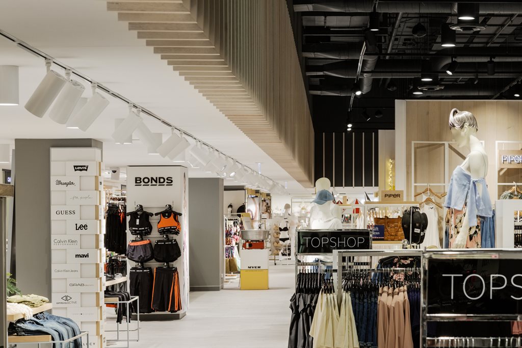
With customer service and localisation as heart of Myer’s new strategy for the future of their department stores, Woods Bagot designed the interior and architectural concept of the new Warringah Mall store to create a sensory shopping experience that reflects its location and customer demographic.
Completed in November 2016, Frank Alvarez and his design team curated a concept that balanced the retail demands of high-end department stores with the causal lifestyle of Sydney’s Northern Beaches.
In an attempt to reimagine the lost experience around department stores in days past where service and socialising were paramount, the team sought after a design that incorporated relevance, customer character and brand equity in a way where shoppers were placed at the heart of all decision making.

Raised ceiling heights create a theatrical experience for the customer

The new zones sit comfortably alone, while seamlessly interacting well with other sections of the store
“Architecturally we crafted a series of components and rooms that define departments which create opportunities for stand-alone brands to stage their experiences, all while enabling an efficient overlay of the Myer brand and services,” explained Alvarez.
The façade, for instance, is one of the highlights of the new store as it creates a sense of anticipation in Myer’s customers. The new-double height fritted glass entrance is something usually seen on the high street, not a shopping centre on the Northern Beaches.

Engineered stone, glass, fabric and metals have been applied to echo the trends of the area

The kit-of-parts approach allows clear segmentation between departments whilst allowing natural wayfinding throughout the store
The layout of the new Warringah Mall Myer is also interestingly presented in zones where each sits comfortably on its own while still seamlessly interacting and relating to other sections of the store. This kit-of-parts approach allows clear segmentation between departments whilst allowing natural wayfinding throughout the store. For example, next to some of Myer’s more progressive menswear sits a little barbershop; a nice little touch to cater to the young and hip of the area.

The ceilings' textures create an interesting focal point against the vivid products

The change rooms also reflect the demographic of each section in the department store
The materials used on the finishes were also carefully selected to convey quality and reflect the location. Engineered stone, glass, fabric and metals have been applied to echo the trends of the area, while raised ceiling heights and dramatic visual merchandising create a theatrical experience for the customer.
The new department store is the first major refurbishment of the new Myer strategy and is a portion of a $600 million investment across the business to deliver a more personalised experience for its customers.
Myer Warringah focuses on getting it right for the customer and reimagines the nature of the product, the service and the architecture to best fit the local area and clientele.

