It might not have boded too well to begin with. When approached with the prospect of Balnarring Retreat, Branch Studio Architects realised the site necessitated a “specifically non-specific” building. A clear brief, to be sure.
For the site in Victoria, the client wanted a fully-functioning private residence that was capable of switching said functions at the drop of a hat. Or more specifically, at the pull of a curtain, or the folding of a bed. The space was to have multiple personalities: as a knitting studio, a reading room, a small bar for weekends spent with friends, a yoga room, and a gathering place for Christmas lunch.
Of course, it also needed to be a home.
The resulting space might be small, but it has room for a lot of surprises. When designing the building, Branch Studio Architects eschewed technology in favour of “craftsmanship”. Balnarring Retreat is purposefully lo-fi, and the low-tech aesthetic supports the operation of the building itself: as a retreat intended for slowing down.
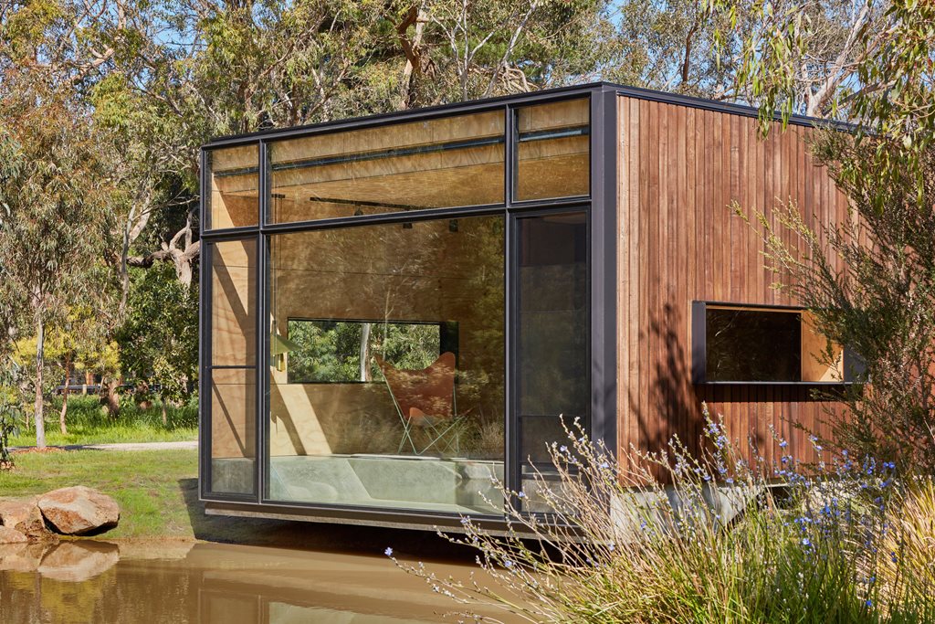
“Celebrating craftsmanship and integrity of materiality instead of technology, every wall of the building [has] been designed to contain components that manually fold, open and close to manipulate the space and transform the program of the building,” says Branch Studio in a design statement.
“Rather than pressing a button on a remote control, the inhabitants must fold and unfold the various components by hand, mindfully manipulating the very space they inhabit and therefore becoming a part of the space, not a master of it.”
On the south wall, the foldable bed shares space with a desk, bookshelves, storage, and a concealed air-conditioning unit. The east wall is home to a series of flaps that can be manually manipulated to form a long dining table, behind which can be found a narrow storage area.
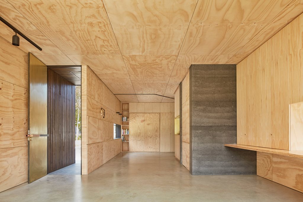
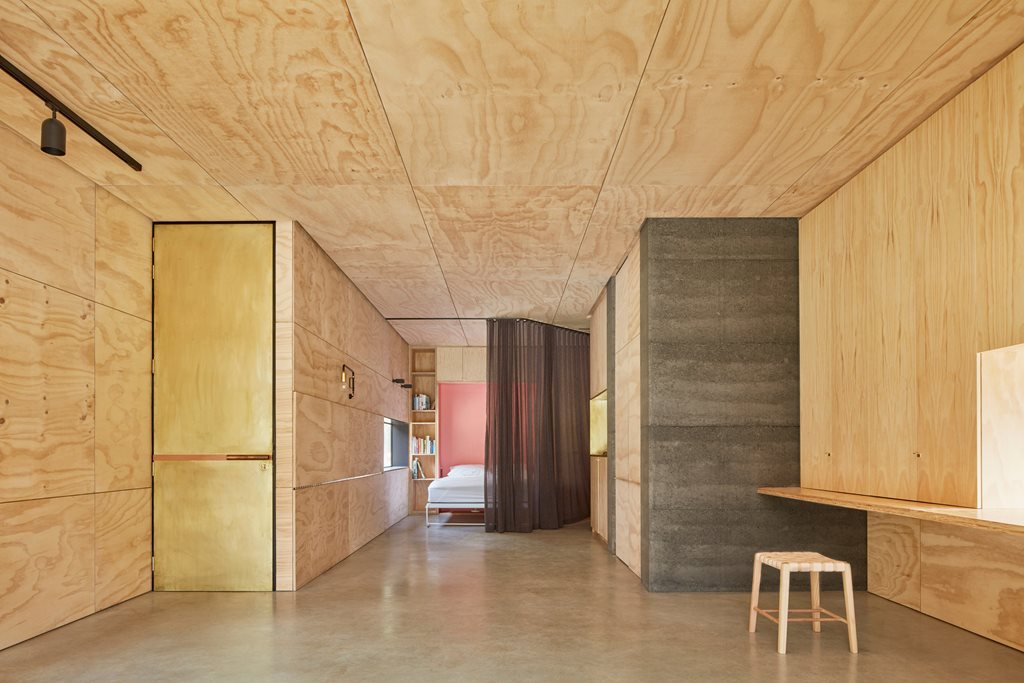
To the west of the house is the kitchen. Of course, this space too performs multiple functions. Beside the kitchen sits behind a work space for the client – consisting of a large desk area with concertina doors that conceal ‘everyday mess’ – and a separate standing desk that is created by folding down a flap. This western wall also contains a hidden door that leads to the bathroom.
Just as the internal space is meant to create a sense of tactility and interactivity, the façade design is meant to facilitate a sense of place, and a connection with context. A tinted, glazed glass wall takes up almost all of the north frontage. From the outside, the glazed wall acts as a mirror, reflecting the waterside context back on itself. From the inside, this welcomes sunlight in and allows views out. The space has been designed with this exact purpose in mind. For instance, the sunken day bed has been deliberately placed for “duck watching”.
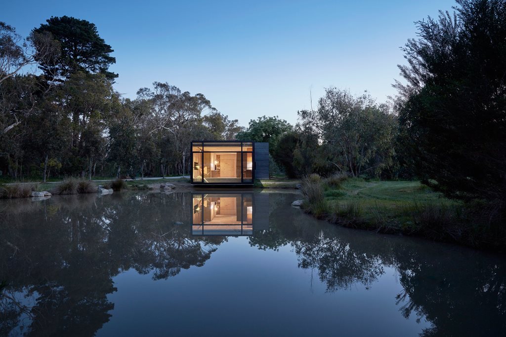
“The response to the open-ended brief for a non-specific ‘studio and retreat space’ was to create flexibility through adaptability; the idea that the space can be divided or united depending on the requirements of that given moment,” says Branch.
“At the heart of it all was the idea of retreat; a slow-moving space that would provide a haven from the hectic paces of modern life; a slow building for slow living.”

