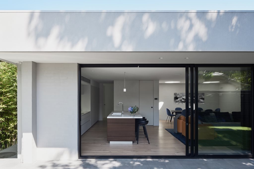
‘Young children’ and ‘peacefulness’ are not commonly associated terms. However, ‘landscaping’, ‘soft palettes’ and ‘defined spaces’ are mitigating factors, able to be inserted as appeasing middlemen in the hope of fostering a closer relationship between the two.
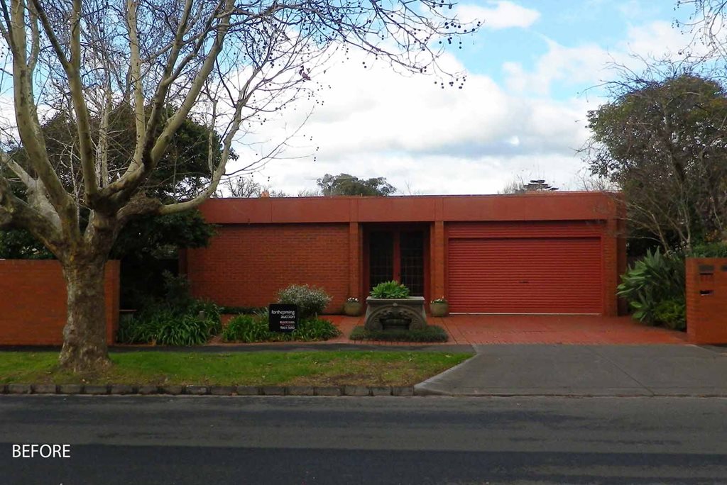
The conceptual framework that Pleysier Perkins Architects conceived for Malvern East 3 was simple in theory, but required nuance in its execution. The original home was the product of a 1980s pet project, led by an engineer who had designed and built the house by (and for) himself. Although the present day occupants wanted to retain as much of the original building fabric as possible, their needs were different – more modern, more familial – than the original scope allowed for.
The footprint, fabric and ‘character’ of the single-level brick house were largely retained, aside from the addition of a master bedroom suite. Outside of this, the affect of the architectural intervention led by Pleysier Perkins was more subtle and conceptual than your usual renovation.
“The clients like the flow and feel of the house, which was already well-orientated,” explains the architect. “But [they] required an update to the original layout to make it functional for a young, growing family.”
From here stemmed the idea to change spaces in subtle but tangible ways, with the end goal of achieving more defined usages. Existing spaces were, in the words of the architect, ‘revisited’ rather than reconfigured. Openings were inserted, living spaces were connected to their surrounds, bedroom zones were more clearly delineated, and a softer palette was gently nudged into the interior. All of this was done with a considered approach to landscape, which was brought into the home wherever possible.
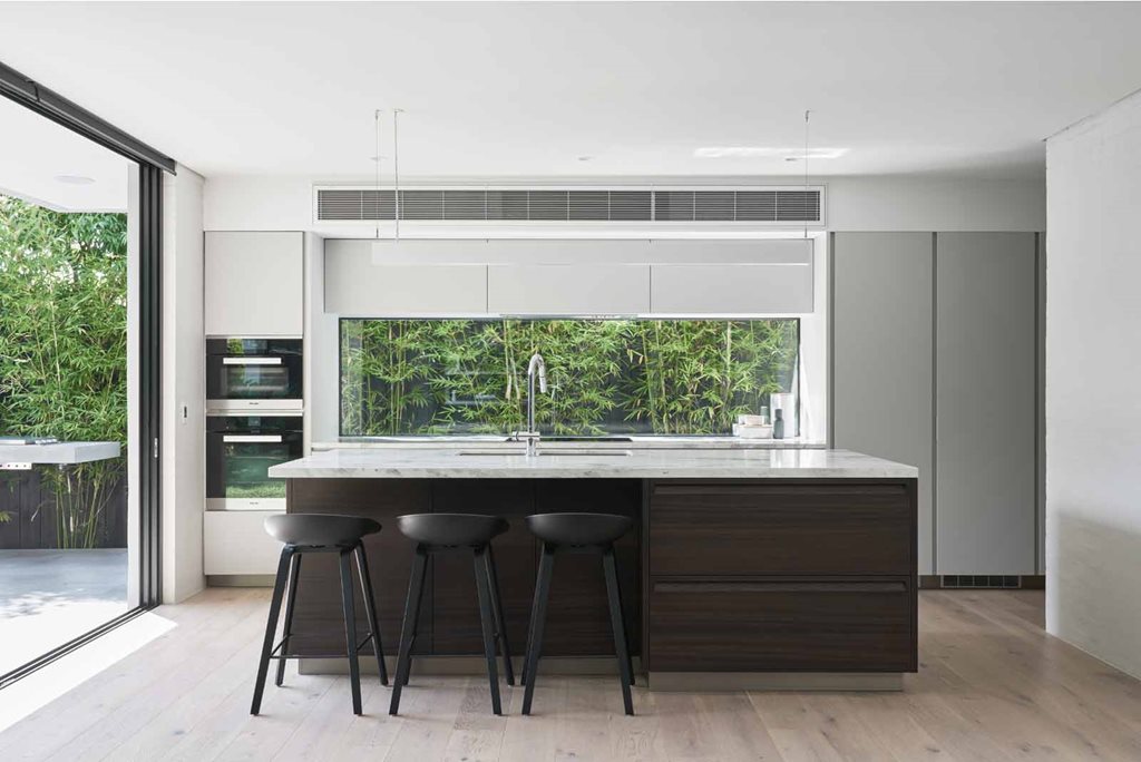
“[The clients] have found it ‘unexpectedly peaceful’ due to the glimpses of greenery and the soft colour palette,” says the architect. “Not bad considering there are now two little kids running around!
“The functional layout works well for the young family and they have found it easy and comfortable to live in. There is a deliberate zoning between the parent’s wing, public areas and kid’s zone. This enables a degree of order that limits the stress within a young clan.”
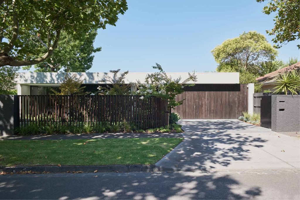
More than just an overhaul of colour and connectivity, the architects introduced new materials and material benefits to the 1980s build. Granted, this wasn’t possible to a great degree considering the contextual heritage constraints, but they were at least able to include a delicate addition of stucco render and timber to the strictly single-level build. This departure from archetypal red brick architecture helped to soften the visual impact of the house from street level, rather than being limited to interior affect.
A landscaped garden and curved fence were also added to the street-facing frontage, which granted a degree of privacy to the master bedroom suite addition.
“The client’s brief has been exceeded, with the house being more functional than they thought possible in a house of its size,” the architect concludes in a bout of (justified) bragging. “The inherent peacefulness has been an added bonus, and they have now created a home for their young family.”
