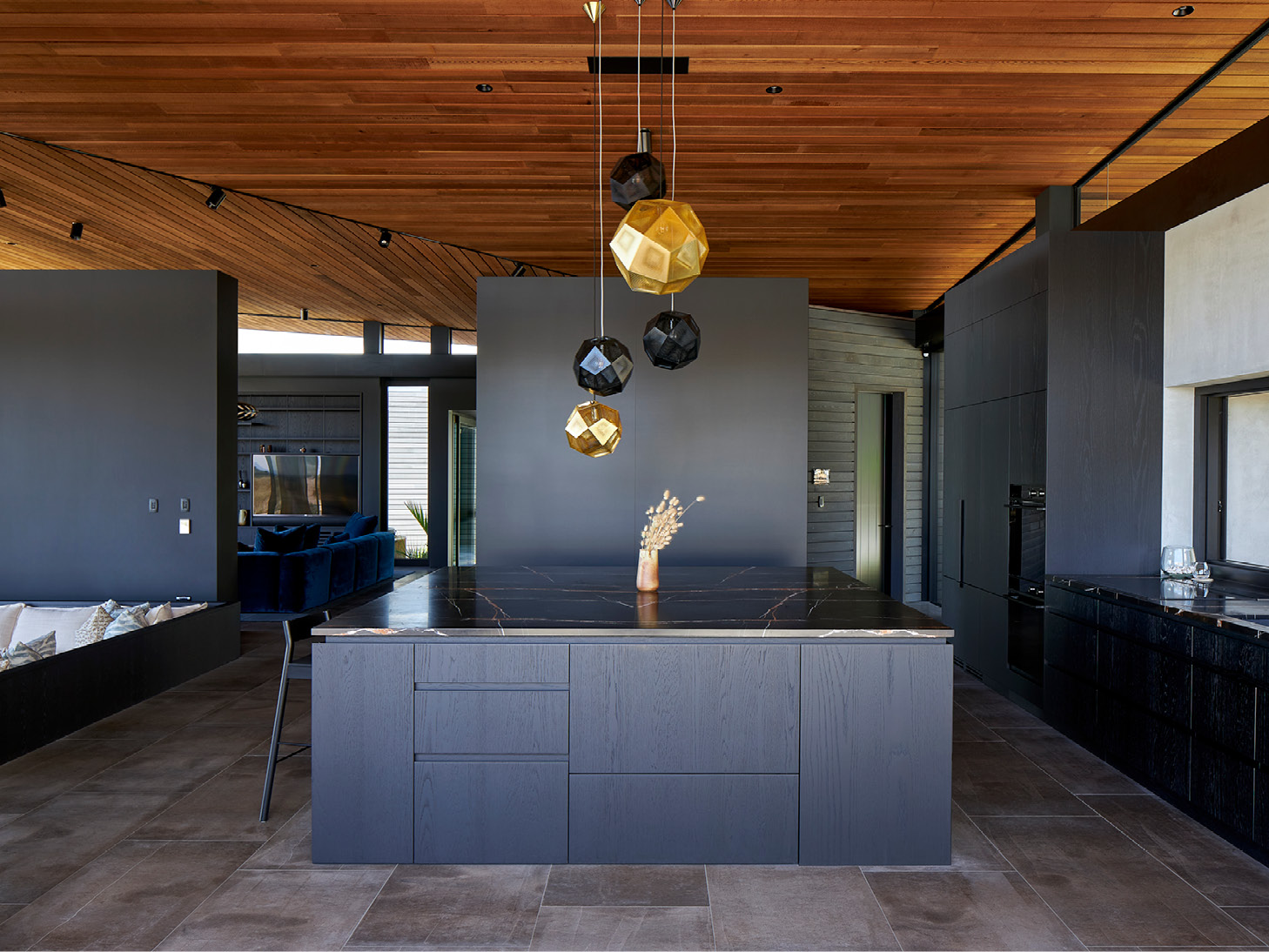
At Te Arai, on northern New Zealand’s east coast, Sandiland, designed by Studio John Irving Architects, deftly balances intimacy with hospitality and opportunities for expansive living with shelter and refuge.
If there is a singular defining element of Sandiland – it’s the dramatic planar roof. An optical illusion, of sorts, it hovers above the grounded elements. Although the reality, of course, is that this hovering mass is discretely supported above horizontal bands of glazing.
Sky and earth are good themes for Sandiland, designed by Studio John Irving Architects, a practice that has contributed several other predominantly low slung, weathering structures to Te Arai, a place where links golf courses and architecture thread neatly through coastal dunescape and pine forests. Uniting each of Irving’s Te Arai projects is a desire to respect the undulating, windswept scenery and maximise the connection to the pristine beach and big views of sky and sea, dune and forest, and Sandilands is no different.
Great architecture is often drawn from the characteristics of the site and the personality of the client. At Sandilands, Irving has drawn inspiration from a generous, hospitable client and the natural beauty of the surrounding environment. The house is designed for prospect and refuge. It has the capacity to open up, but is equally designed for warmth and intimacy, privacy and comfort.

The brief, Irving says, was relatively relaxed. Sandi, the owner, whose name was incorporated into the project name, requested “intimate spaces, so she didn’t feel like she was rattling around”, as well as “places that she could retreat into.” However the house also had to perform on demand – to open up for parties and hosting guests.
The architectural response consists of five separate cedar-clad rooms – or blocks – which provide accommodation and an art studio. Connecting them are generous and open living, kitchen and exterior spaces that allow the occupants to effortlessly live and entertain inside and out.

Creating refuge
Coastal homes are often light and bright. Here, however, the choice of dark-stained joinery contributes to the overall sense of refuge created by the architecture, which is contrasted by the broad, horizontal insertions of glazing and sunken exterior seating area, which contribute a sense of prospect – the ability to look out to big skies and seas, sand dunes and forest from a position of shelter and comfort.
Through stacked sliding doors, the addition of an outdoor kitchen continues the line of the interior cabinetry through to a sheltered deck, blurring notions of where the house ends and where the exterior begins are blurred. As with the interior, the deck is replete with intimate areas to gather, defined by varying levels. An outdoor fireplace and lounge setting is tucked around the corner from a sunken, circular fire pit. The expansive silvered timber deck that eventually gives way to rolling dunes.
Both interior and exterior ‘rooms’ are adaptable spaces, linked from above by the timber clad ceiling, a warm link and unifying device with the arrangement of perpendicular battens suggesting a delineation of the open space below.
The luxury of simplicity
While the spaces blur, what is not in question is that the kitchen is the heart of this home, and that the impressively scaled square island is the heart of this kitchen. Overall, the kitchen has been kept as open as possible to maximise the potential for hospitality. In keeping with the luxury of simplicity that defines the overall aesthetic, appliances are integrated with care and distributed to where they are most useful.
The generous square island bench and lack of scullery or butler’s pantry also declare that the kitchen is a space to socialise. This choice was also driven by a desire to “keep it simple,” says John. “It’s not a big house, so it is okay to have it all out in the open, but we needed enough appliances, so things don’t pile up.”

Irving explains that he chose “integrated appliances appeal because they fade into the background.” It is an exacting fade, with Fisher & Paykel appliances integrated with care. The minimal gaps afforded by the appliances create a seamless material finish with the cabinetry. Those cabinets cloak an integrated French-door refrigerator-freezer with a simple, beautifully crafted custom timber pull handle. Dishwashing solutions and an integrated CoolDrawer™ Multi-temperature Drawer are also incorporated seamlessly into the aesthetic of the room – the luxurious attention to detail in the outdoor entertaining space is accentuated by the functional placement of the CoolDrawer™, allowing for chilled drinks and snacks to be brought forth at a moment’s notice, without need for a noticeable bar fridge.
Fisher & Paykel’s Minimal style products paired with integrated appliances are the key to creating crafted and material led kitchens without compromising on performance and functionality. The black-stained timber cabinetry frames two ovens for ease of use when entertaining. Irving says he selected Minimal style appliances according to his “usual approach” – that is, “to do our best to make them disappear.” Through seamless integration and visually recessive product choices, he achieved his trademark “desire to keep the materials honest, simple and very robust.”
Practice: Studio John Irving Architects
Photography: Simon Wilson

