A well-designed home is a true reflection of the owner’s unique style and personality. The design process can be quite complex, especially when the homeowner’s vision and expectations need to be considered from a technical perspective.
James Hardie Australia discusses with renovation experts and two-time The Block contestants, Josh and Jenna, as well as the principal designer at Arcologic Design, John Damant about their tips for balancing shapes, textures and colours to help you create a unique home that is also technically feasible.
Trend alert: Asymmetrical exteriors
Josh & Jenna: Asymmetrical design can be one of the more complicated design techniques to pull off, but when done well, it can result in beautiful and exciting exteriors.
Symmetry on an exterior can come across as safe and formal, whereas an asymmetrical exterior can add interest. It allows people to create unique homes that show off their creativity and personality.
It’s all about juxtaposition
Josh & Jenna: Asymmetrical balance is achieved by the juxtaposition of different elements including colour, shape, texture and scale. Good asymmetrical design includes balance so that no one part of the project is too heavy for the rest.
John: A good example of this is our award-winning Pavilion Home in Bridgetown. We’ve contrasted the colours of the old and new cladding. The larger scale horizontality of the Scyon Stria also juxtaposes the more traditional look of the cottage. The contrast of the grey against the timber decking and ceiling is also very striking.
It’s all about balance
Josh & Jenna: Asymmetrical design is all about balancing design elements. For example, large areas of lighter colours should be balanced with smaller, darker areas. Small complex shapes are balanced by a large, simple shape.
You want to turn heads for the right reasons so carefully consider the balance on your exterior.
John: It’s all about balancing the materials too. The composition of this home, although asymmetrical, still gives a very clear reading of the various components. For example, the skillion roof is emphasised by being separated from the brick walls by the Scyon Axon cladding, which is then reintroduced in the garage wall but in a lighter colour.
Getting the right mix of materials
Josh & Jenna: To achieve balance, a larger portion of your exterior should be more minimal. For example, try cladding your exterior in light-coloured Scyon Stria board and balance with darker colours. Scyon Axon boards looks great painted in a dark charcoal and can be laid vertically to balance the horizontal Stria.
This way the charcoal section will add interest but because it’s a smaller section it won’t dominate your facade and look too bulky.
Harmonising the look
Josh & Jenna: If your eye seems to wander around the design evenly, then you’ve likely achieved balance. Think about equally interesting elements scattered throughout the design (kind of like confetti!) with careful consideration of colour, scale, texture, and placement.
Ensure you contrast hard, straight lines with a soft curve to give your exterior a softness and avoid your home looking too abstract.
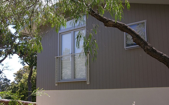
John: It is also important to play with the idea of verticality and horizontality depending on the effect you want to achieve. In this beach house below, we used a vertical Scyon Axon to mimic the bark of the surrounding Marri trees and painted it in a similar tone of grey to the bark as well.


