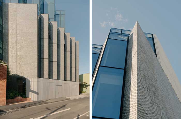
Encore Cremorne is more than just a seven-storey office building. While part of the neighbourhood character, it’s a premium-level boutique office space and an important marker of change for the suburb’s entrepreneurial and creative workers.
Renowned for its active, agile architecture it’s no surprise that Fieldwork Architects is the creative talent behind it.
In true Fieldwork style, the design acknowledges the building’s past and provides clear direction for the suburb’s future. So while Encore Cremorne is contextual and respectful of the neighbourhood, it also makes a strong statement within the ‘new’ Cremorne.
“The site has a beautiful existing brick heritage façade, which was previously used as a recording studio, so it contributed a lot to the street presence on the ground floor. But there wasn’t a lot of architectural value in the building behind, so our design looked at how we could set a tower form above the heritage base to have a dialogue with the heritage building without mimicking or blending the heritage with the new,” explains Tim Brooks, Associate, Fieldwork.
The clear design distinction comes in the form of a dynamic concertina zigzag curtain wall, alternating between glass and brick, which is set above and back from the original heritage facade. It’s nothing short of spectacular.

“It’s a really long skinny site and the streets of Cremorne are quite narrow, so we wanted to make a dynamic building so that when you’re looking down the small narrow street towards our building there’s a sense of activation, rhythm and movement to it,” says Tim.
The simple material palette of glass and bricks in the zigzag wall creates a clear distinction between old and new, while also connecting them. The zigzag glass curtain directly above the heritage facade is modern and distinct from the red brick. To bridge the gap between the two, Midnight Blue brick tiles offer a textural similarity, yet different finish to the red heritage brick. It’s a perfect combination.
“We didn’t want a solid colour, we wanted to have that textural quality of the heritage brick, where there is colour variation. And the Midnight Blue spoke to the glazing as well, which was a silvery blue colour, so it played with that, too,” adds Tim.
Brick inlay proved flexible and beneficial in realising Fieldwork’s facade design. “Part of the benefit of using brick inlay is that we used the same Robertson product, but with three different application methods to suit the construction,” explains Tim. First, it is used in a precast panel of Midnight Blue brick tiles on the side wall, then incorporated into the anodised curtain wall panel on the front of the façade that alternates between glass and brick, and lastly used in a more traditional lay on the level one terraces set back beneath the glass curtain wall.
“The detailing of the curtain wall and the glass is something we’re most proud of. It has the crystalline appearance that we were looking for, and the textural quality of the Midnight Blue brick tiles playing into that form. Making use of that concertina with the alternating panels of glass and brick is a really great outcome for the project,” concludes Tim.
The geometry and execution of the concertina wall sets a new design landscape in this long narrow Cremorne street. Fieldwork is to be congratulated for delivering such a dynamic building, its beautifully shifting quality making an indelible mark on Cremorne for many years to come.
Project details
Architect: Fieldwork Architects
Product: Brick Inlay with Midnight Blue Brick Tiles
Developer: MONNO
Interior Design: MIM Design
Builder: HACER Group
Precaster: LUX Precast
Landscaping: Open Work
Photographer: Tom Ross

