To most people, hospitals are stressful environments and not a pleasant experience, a situation that’s made worse by the building’s drab, grey and unwelcoming appearance.
However, in recent years, a growing body of research linking patient wellbeing to the quality of their surroundings has inspired some amazing hospital interior designs, with colour, light and minimalism all playing a role.
1. Colour

Hospitals were once grey or white on the inside; cold, bright light from fluorescent tubes flickered in bland rooms where patients tried to rest. But colour has made a comeback and white is no longer the exclusive friend of recovery.
At the Teenage Cancer Trust unit in Birmingham’s Queen Elizabeth Hospital, interior designers Lucy and Tobie Snowdowne from London design agency, Two Create were inspired by interviews with patients to produce rooms with colour and life.
From images of New York to the bright red of a formal dining room, colour became part of the recovery.
“Consultations with the patients revealed that they felt bored and claustrophobic in the sterile environments they were confined to during the course of their chemotherapy,” according to Two Create’s website. “Independent research also highlighted a link between a positive environment and an increase in recovery levels in cancer sufferers.”
The agency’s diverse product record includes a cosmetic range, ‘Pure Colour’, which linked makeup design to the colours of fast fashion. They have also designed lipsticks for Givenchy.
The Royal Children’s Hospital in Melbourne has won multiple awards for hospital design and sustainability. Built on the edge of Royal Park, north of the city’s CBD, nature underpins the design – from the natural textures used to the colours of the surrounding parkland. The external façade is designed to reflect the colours from the surrounding trees.
“We took references of the eucalypts in the park and literally mapped them onto the building. So the outside of the building is like a tree; it’s built like tree bark and is made out of different layers of the grey colours of the trees,” lead architect Kristen Whittle from Bates Smart Architects, told Healthy Parks Healthy People Central website.
Inside, the designers sought to ‘deinstitutionalise’ the hospital experience.
“So instead of having the waiting area look like a waiting area, we’ve tried to engender a sense of fun and discovery,” said Whittle.
“For example, the seats are coloured, shaped and textured in an interesting way. They’re much more of a reference to boulders (and) gardens, so they don’t look like seats.”
2. Light
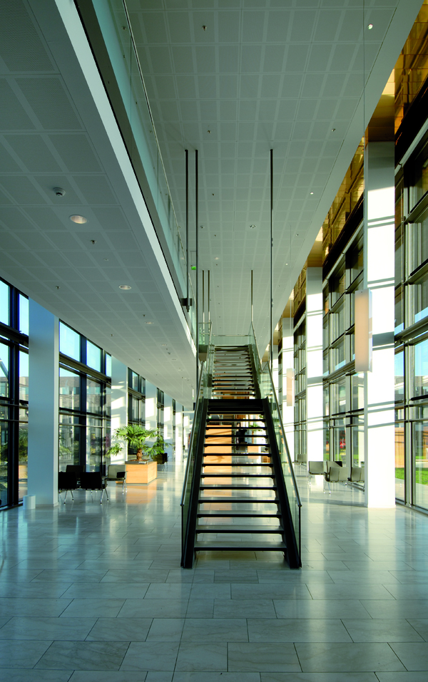
As an increasing body of research points to links between natural light and improved patient wellbeing, hospital designers are looking to give patients a room with a view. This is particularly true in Scandinavian countries that are challenged for light in the winter.
At Vendsyssel Hospital in Denmark, banks of glass bring light into the common areas of the hospital. That light is perpetuated where possible through the use of light colours on ceilings and walls.
“The ceilings had to contribute to the overall picture of the building by also being light in colour and welcoming,” said Kirsten Myrhøj from architectural firm, NORD, who designed the hospital.
Myrhøj chose Knauf’s Danoline ceiling tiles for their aesthetic and acoustic performance.
Hamlet Private Hospital in Denmark also uses large banks of windows to bring light inside. One of the lobby areas feels almost like a greenhouse, with windows surrounding each side of the space. The hospital’s technical manager, Kasper Faerk Jacobsen said the layout, lighting and colour scheme on the walls had to create a peaceful expression.
“Danoline ceiling tiles helped create this, thanks to their discreet design,” he said.
3. Minimalism
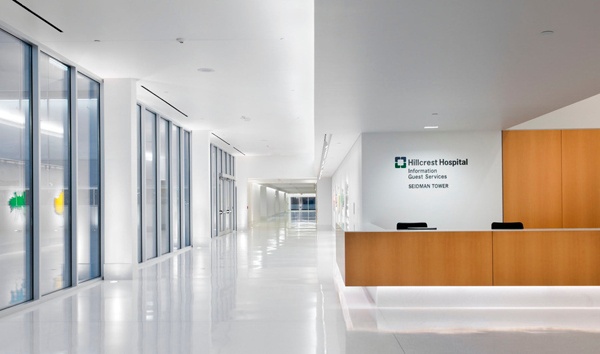
Fans of minimalism will take inspiration from the Hillcrest Hospital in Cleveland in the US state of Ohio. Its 5-year, USD 163-million project included a new four-storey bed-tower with 72 private rooms.
Designed by architects Westlake, Reed, Lekoksy, it looks more like a museum than a hospital, with white walls and floors and minimalist art and furniture.
Healthcare Design magazine’s executive editor, Jennifer Kovac Silvis wrote of the hospital: “What I found on our tours were very minimalistic interiors complemented by a standout art program that showcases commissioned works right alongside prints of infamous classics.”
“There are floor-to-ceiling windows lining corridors… this light connects inhabitants with the elements and changing seasons outside, with the intention of creating a distraction much greater than what soothing colours or landscape images could achieve,” Kovac Silvis said.
“And it’s silent. From sound-absorbing ceiling panels to offset the hard surface floors to systems running without any noticeable buzz, patients and staff alike are left with a soothing environment absent of distraction, a place where they can focus and be reflective on the medical situations at hand,” she wrote in the magazine.
To find out more on acoustic design in healthcare and how it can change patients’ hospital experience, download our free eBook from the Knauf 'How To' section on our website.
