Creating a flexible space housing five different entities, which effortlessly expands and contracts to suit current project demands, and separates public areas and work spaces. That was the brief ICON delivered to FIGR. for the fitout of its new headquarters in Richmond. Not only was it going to be the largest commercial fitout delivered by the FIGR. team at 1400m2, but it also had an incredibly ambitious delivery timeframe of just 20 weeks.
It seems that FIGR. is exceptionally well suited to delivering custom commercial fitouts within the Industry Lane building’s constraints in Richmond, and with multiple trades, project managers, suppliers and consultants. And it’s because of the project’s parameters, not despite them, that the end result is outstanding.

Creating a flexible work environment promoting movement was a central component of FIGR.’s design. Though many ICON staff work onsite at projects, during the transition period between finishing one job and moving onto another they return to the office. FIGR.’s challenge was to design spaces so the office could grow in numbers when needed, and not look empty when staff are onsite.
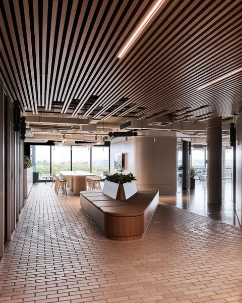
The result is a campus layout where work areas are treated like mini buildings with places to hang out. While a central organisational core houses meeting rooms and shared spaces for collaboration with internal teams and clients, a series of internal streets define the flexible workspaces positioned on the external perimeter so everyone gets views to the sky and external context.
“We really wanted to capitalise on the views outside of the building and bring as much light into the building as we can through these internal streets,” explains Adi Atic, Founder and Director, FIGR.
The flexible zones contain Zoom rooms, co-working zones and hot desks for staff to sit, plug in their laptops and work, and where clients can come in and make calls or send emails.
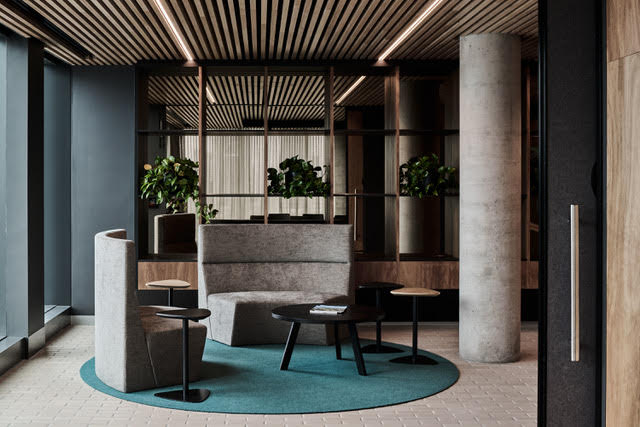
“We’ve established these internal laneways and streets, so they become zones that allow for flexible working arrangements where people can plug and play. For example, a beautiful plywood tunnel that you can walk through is a really flexible space where you can sit on the couches and make phone calls, or write emails and be away from the main work areas,” says Adi.
Most importantly the laneway layout promotes movement. “It’s important for us to have healthy workplaces and we were quite deliberate in having no dead ends so you can move throughout the whole floor plate. This idea of being mobile creates a lot of opportunities for people to interact. Whilst they might be working for different entities and projects, the internal streets are places for them to have chance encounters, which also aids in sharing ideas and knowledge,” continues Adi.

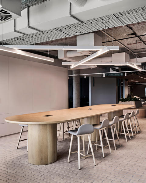
A large proportion of the floor plate is also devoted to flexible breakout spaces, the main one containing a large island bench where staff can sit and have lunch or gather for Friday night drinks.
FIGR. is well-known for its residential architectural prowess and this skill has been transferred to a commercial setting, with brilliant effect. It’s the space’s sense of homeliness and retreat that makes this design so appealing, yet functional. Influenced by biophilic design, a natural Australiana palette helps to create this homely feel.
“We were trying to make what was a stark, sterile shell into something more welcoming and enticing, so there are lots of places within the breakout spaces where we’ve created areas for plantings. And we have Blackbutt timber ceilings and green tones throughout, and stone in the boardroom. Although there is some black, we’ve softened that with greys and warmer tones,” explains Isabel Legge, Senior Project Architect, FIGR.
From a sustainability perspective, FIGR. worked with as much of the existing warm shell of ceiling tiles and carpets as possible, while exposing the concrete ceilings over the workspaces and in the large breakout spaces for extra height. Then, in the public zones, such as the internal streets, the material palette comes into play with those soft eucalyptus and Australiana tones.

Aluminium brick tiles were selected for the internal laneways, referencing the red brick podium of the building.
“The aluminium brick tiles had a really nice tone, which was soft on the eye, and they had a handmade quality about them. It felt like they were less of a production line material, and had more of a handmade aesthetic to them. They also balance the light, making it look soft and inviting; especially where there’s no direct light on these materials, we always look to use a more natural material and tone. And again, this tied back to our Australiana palette. It really paired well with the Blackbutt timbers and the eucalypt hues,” Adi reflects.
The fitout was not without its challenges. With tight timeframes, local materials and suppliers were sourced to reduce lead times. And given the small size of the service lift, when elements were fabricated offsite, the team had to be creative in working out how they could be delivered in pieces then put together onsite. Collaboration was key to an outstanding result.
“It’s a testament to collaborating together to achieve something in a short timeframe, but also something that tries to push boundaries, because it’s a little bit left field of what you see with a lot of other commercial office fitouts,” reflects Adi.
ICON is ecstatic with its new office, but most gratifying for FIGR. is the overwhelmingly positive feedback it receives from its peers, who’ve met with ICON in its new office, particularly about shared spaces and hot desk areas. Receiving high praise, rather than critique, from fellow architects is the most rewarding feedback of all.
Project details
Architect: FIGR.
Product: Aluminium Brick Tiles
Project Manager: Monto Projects
Builder: ICON
Property Owner: Salta Properties
Photography: Tom Blachford