We believe great spaces inspire greatness, and none are complete without great colour. Colour has the power to transform, affecting mood, evoking feelings beyond words, and ultimately changing our lives. As renowned Colour Specialist and Professor, Jada Schumacher, explains, "Colour has immense power in our world. It can make your office feel dreary or inspiring. It can convey narratives and lead to life-changing discoveries. It can be pragmatic for survival, wayfinding, and creating a sense of place. Colour can be a game-changer.”
Our latest collection of wallcoverings, fabrics, and acoustics embodies this belief. It encompasses 6 compassionate tones designed for reconnection – as an antidote to today's fast-paced, technology-driven world. After all, the desire, as Jada says, is to create "immersive spaces that conjure up a connection to somewhere else”.
This yearning for connection is reflected in our approach to design and the colours chosen for private, work, and public spaces. Top design trends are shifting away from cold or overwhelming colours towards those that evoke warmth, community, and, above all, a return to nature. Jada sums it up perfectly: “we’re bridging the gap between the digital world and a more grounded, human experience."
Timeless retreat
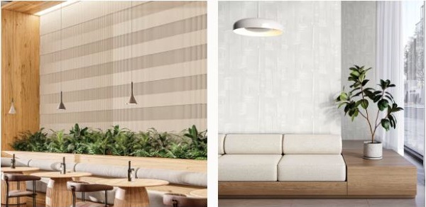
Ivories, linens, and parchment-like tones serve as a foundation for creating an atmosphere that feels both timeless and effortlessly serene. These quiet tones create environments that feel both anchored and airy – where time seems to slow down.
Ideal for health and wellness spaces where stepping away from the hectic pace of daily life is encouraged and required.
Shaping moods
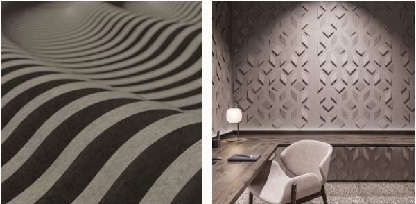
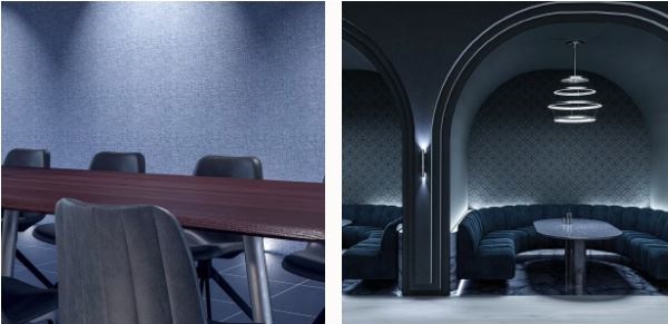
Storm-like greys boast complexity and character, representing endurance and timeless elegance. Their bold intensity injects a touch of mystery and depth, while their innate neutrality anchors and complements a spectrum of other colours.
This enduring, balancing tone is perfect for establishing a welcoming atmosphere in commercial office and hospitality spaces.
A quiet calm
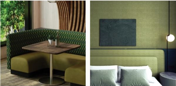
Capturing the evolving tones of the land through the seasons, these meadow-green hues beautifully enrich spaces with an earthiness that evokes a sense of peace, vitality and growth.
The softness of these hues is ideal for commercial office and education spaces requiring an inspiring atmosphere.
A hopeful hue
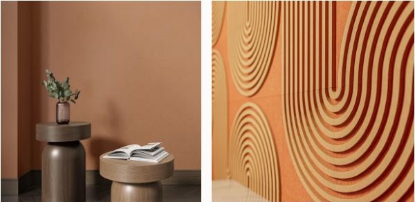
The comforting tones of terracotta, saffron, and clay infuse interior spaces with a sense of energy. They symbolise timeless vitality and enduring beauty, evoking a connection to ancient traditions and the healing power of nature.
These hues create a crucial calming ambiance for wellness and healthcare spaces, as well as corporate breakout spaces.
Nature’s elixir
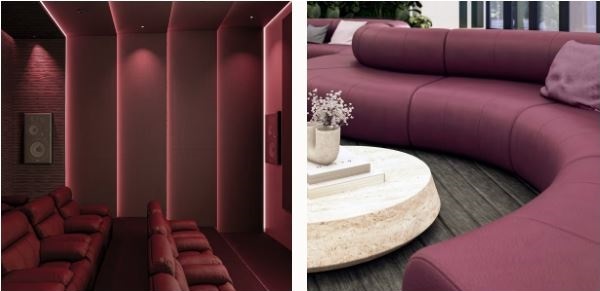
Opulent, bold and timeless, these deep purple hues symbolise power, creativity, and ambition, inviting an artistic allure into interior spaces.
Commercial office and hotel environments provide the perfect environment for this aspirational, restorative hue.
Peaceful purpose
Enchanting and reminiscent of the deep hues of twilight, these blue-indigo tones bring an unparalleled sense of serenity and an ambiance of understated elegance.
This shade is an ideal choice for hospitality and retail spaces where harmony and intention combine.
See our new hues brought to life in inspiring applications across wallcoverings, fabrics, and acoustics in our latest Colours Lookbook.
